
Beyond Size: Uncovering the Engagement Efficiency of YouTube's Quiet Outperformers
Trailer
The company's influencer marketing strategy is underperforming: high-budget partnerships with large YouTube channels are delivering reach, but weak engagement and poor conversion.
In response, Alex, the data analyst, proposes a new targeting framework focused on engagement efficiency rather than raw channel size.
The analysis is structured around four research questions:
1. How can quiet outperformers be rigorously defined and identified while controlling for sampling bias and channel size?
2. Are quiet outperformers concentrated in particular content categories, or do their engagement efficiency patterns vary across categories?
3. Which content and strategy choices are statistically associated with higher efficiency within each size tier?
4. Do channels that currently exhibit exceptional engagement also show historically stronger or more stable growth patterns?
Now let’s walk into the boardroom.
Alex
The Analyst
Logical, data-driven problem solver.

Diana
Chief Financial Officer
Cold, precise, ROI-obsessed.

Leo
Head of Content
Energetic strategist chasing virality.

Sarah
Chief Brand Officer
Risk-averse, safety-focused guardian.

Marcus
VP of Marketing
Traditionalist, brand-first thinker.
On a late Friday
The executives gather in the boardroom. The mood is grim; even the air conditioner sounds stressed. On the main screen, Diana is presenting the company’s latest financial report. No one is smiling.
Diana: Okay everyone, let’s not sugarcoat this. Our marketing campaign has taken a massive hit. We poured money into the biggest YouTubers on the platform, and instead of growth, we’re down 15%. The board wants to shut the influencer program down on Monday.
Marcus: It’s not the program’s fault, Diana. It’s the market. We worked with the biggest names. You don’t get better reach than that.
Diana: The sales team says people are clicking. They just aren’t clicking on us. We are burning cash, Marcus.
Alex: (Bursting into the room, looking tired as if he hasn’t slept all night) Wait! Let’s not kill the program yet. We just need to change who we are paying. It’s not the market, and it’s not the product. It’s the ghosts.
Marcus: Ghosts? Alex, please tell me you didn’t stay up all night just to crack jokes. And where do you get your data anyway?
Alex: I’m serious. I built this on YouNiverse, one of the largest publicly available academic datasets ever released on YouTube.
We’re talking about 136,000+ English-speaking channels, almost 73 million videos, and multi-year histories of views, subscribers, and audience interaction.
I’ve been staring at the data for the past week. Something with our engagement just wasn’t adding up. Those subscribers, those views… for the big channels, they were just an illusion. We need to put our money into the Quiet Outperformers. They will give us the most engagement for every dollar spent.
Leo: Quiet Ourperformers? What are those?
What are Quiet Outperformers?
Alex: While analyzing the YouNiverse data, I found something very interesting. There exists a massive group of channels with low subscriber counts but engagement far above what their size would suggest.
To make the comparison fair, I focused on channels below 100,000 subscribers. That cutoff isn't arbitrary. It lines up with YouTube’s Silver Creator milestone, the point where channels start to receive systematic algorithmic and brand advantages. Within this range, engagement reflects genuine audience connection rather than platform momentum.
And there are plenty of these channels with much higher than expected engagement! If we put our money here, we can get a lot more of these small-to-mid-sized channels, and they will get us way more Engagement Efficiency. I’ve prepared extensive analysis for this, and yes, Sarah, knowing you’re colorblind, I made sure all visuals use a colorblind safe color scheme.
Marcus: (Squinting at the screen) Wait. ‘Engagement Efficiency’? Is that a real industry term, Alex, or did you just make it up?
Alex: It’s a metric I created because the industry terms were lying to us. Essentially, for every single view, this tells us how many people cared enough to actually do something. The Mega-Stars get views, but nobody touches the keyboard. These Quiet Outperformers? Their audience is glued to it.
Engagement Efficiency
Why did I define this? When I started comparing channels in the YouNiverse dataset, it became obvious that raw metrics, views, likes, subscribers, were misleading. Big channels collect views almost automatically, but that doesn't mean their audience is actually engaged. Smaller channels, on the other hand, often have fewer viewers, but those viewers interact far more intensely. I needed a way to compare channels fairly, regardless of size. That's why I introduced engagement efficiency: a metric that measures how actively a channel’s audience reacts to its content.Definition:
For each channel \(c\), I define engagement efficiency as: \[ E_c = \frac{\text{likes}_c + \text{dislikes}_c + \text{comments}_c}{\text{views}_c} \] This tells me, per view, how often the audience responds. A higher value means viewers aren't just passively watching, they're participating. This was the first clear signal that many small and mid-sized channels were dramatically outperforming the Mega-Stars we paid for.
But finding them wasn’t as simple as sorting a spreadsheet. Engagement efficiency naturally changes with channel size, smaller channels tend to look “better” simply because they’re small. To separate real Outperformers from this size effect, I needed a model that captures what level of efficiency is expected at each scale. That’s where the log–log linear regression came in.
Log-Log Linear Regression Model
Why a regression model?Engagement scales with channel size, big channels get more interactions simply because they’re big. To spot true Outperformers, I needed to know how much engagement a channel is "expected" to get for its size.
Because views and subscribers span several orders of magnitude, I modeled the relationship in log-log space.
The model:
\[ \log(E_c) = \alpha + \beta \cdot \log(\text{Subscribers}_c) + \epsilon \]
Identifying Outperformers:
The residuals (\(\epsilon\)) show how far above or below expectation a channel is. Channels with large positive residuals, the top few percent, are the Outperformers.
Every dot in the upper cluster represents a channel performing well above its expected engagement for its size, punching above its weight. You can hover over individual points to see the channel name and subscriber count. The background density contours represent the distribution of all other channels, showing where typical performance lies; against this backdrop, it becomes clear that Outperformers are far more prevalent among smaller channels and increasingly rare as subscriber counts grow. Using this distribution, I set a threshold at the top 3% and identified 2,831 Quiet Outperformers.
Leo: “2,800… that’s a goldmine.”
Alex: I also wanted to see how these Outperformers’ engagement efficiency develops as their video catalogs grow over time, from 2005 to 2019.
Rolling Reaction Efficiency
Reaction efficiency:At each time step, engagement efficiency is computed as the ratio between accumulated audience reactions and accumulated views:
Reactions refers to the total number of user interactions on a video, defined as the sum of likes, dislikes, and comments recorded at crawl time.
\[ E(t) = \frac{\text{reactions}(t)}{\text{views}(t)} \]
Smoothing over time:
Because new videos are added irregularly, efficiency changes in discrete steps. I apply a short trailing average to smooth cohort transitions for visualization.
All values are computed from data frozen in 2019. The rolling average only smooths the visualization and is not used to identify Outperformers.
Some Top Overperformers
Alex: Against their expected baseline, it’s clear they perform much better. And not just once. Some spike, sure, but many of these channels sustain high efficiency for years.
Marcus: (Leaning back, looking less skeptical) Okay, Alex. I see the math. These ‘Outperformers’ have great engagement stats. But we can’t just throw darts at a list of 2,000 random channels.

Leo: Exactly. Even if we believe in Outperformers, we still need to know where to look. What if we accidentally sponsor a flat-earth theorist or a channel that has nothing to do with our audience? We need control.
Alex: That's the right question. And it turns out... categories matter more than we thought.
Where the Outperformers Live and Why It Matters?
Alex: I started where everyone starts: YouTube’s official category system. There are 15 labels, such as ‘Gaming’, ‘Entertainment’ and ‘People & Blogs’. They look neat. They’re also terrible. ‘People & Blogs’ is a junk drawer. “Entertainment” mixes movie trailers, late-night clips, and personal vlogs. Two channels in the same category can behave completely differently.
So I ignored the labels YouTube gives us. Instead, I looked at the tags: the actual keywords creators use to describe their own videos. I processed millions of tags from our dataset and used a technique called Latent Dirichlet Allocation.
Leo: (Raising an eyebrow) In English, Alex.
Alex: Think of it as reverse-engineering the communities. I let the data tell me which videos belong together by looking for repeated patterns in the tags they use. Instead of 15 broad buckets, the model discovered 30 distinct micro-communities.
(Alex clicks next. The screen displays the LDA Topic Cluster Map.)
Alex: Once we had these communities, I asked a simple question: Is engagement efficiency the same everywhere? If attention behaved similarly across topics, categories wouldn’t matter.
(Alex points to a plot on the screen)
Alex: Statistically, the answer is a clear no. Some communities naturally produce far more engagement per view than others. The baseline is different. An average channel in one community can outperform a strong channel in another, even before we talk about Outperformers.
Leo: So the category sets the floor.
Alex: Exactly! Outperformers raise you above the floor, but the floor still matters.
So at this point, you might think the strategy is obvious. Just take the communities with the highest baseline engagement and pour the budget into them.
(He pauses)
That would work, if performance were the only thing that mattered. But in the real world, performance attracts attention. And attention attracts competition. When a community consistently delivers strong engagement, brands notice. Budgets pile in. Creators raise their rates.
Leo: So high engagement doesn’t stay cheap for long.
Alex: Exactly. Efficiency creates value, but competition sets the price.
That’s why I asked a second question. If Outperformers were just random accidents, we’d find them scattered evenly across all communities. In that case, categories wouldn’t constrain us. We could hunt anywhere and expect similar odds. But that’s not what the data shows.
(He clicks to show the next slide)
Alex: Outperformers cluster. Some communities produce exceptional channels again and again. Others almost never do, no matter how hard creators try.
Marcus: So this isn’t just about where engagement is high. It’s about where excellence is repeatable.
Alex: Exactly. If the market were already perfectly efficient, these two rankings would line up exactly. The most engaging communities would also be the ones packed with Outperformers.
Leo: (clicking the drop down menu with different sorting criterion) But they don’t.
Alex: No, and that mismatch is where the strategy lives. It gives us two paths, not one.
(He clicked the next slide and a strategy matrix pops up)
Alex: First, the Verified Winners. Communities that rank high on engagement and are already dense with Outperformers. For example ‘Game & Gameplay’and ‘Comedy Vlogs’ These are reliable. Predictable. But crowded, and therefore more expensive.
Marcus: And the others? Like ‘Sports & Music’?
Alex: That’s the Opportunity Gap. Communities where engagement is strong, but Outperformers are still relatively rare. Less competition. Lower prices. More uncertainty, but far more upside.
(Alex looks around the room.)
Alex: There isn’t a single ‘best’ strategy here. One path buys us stability. The other buys us leverage. The mistake isn’t choosing one over the other, it’s pretending they’re the same.
(The room is quiet. This time, thoughtful.)
Marcus: (leaning back) Wait. Even if we accept that these Quiet Outperformers exist, they're still just the ones who worked yesterday. That doesn't tell us who will still work when budgets scale, prices change, or new channels appear.
Sarah: And it gives us nothing to audit or defend.

Alex: Exactly. If engagement efficiency is real, it should leave fingerprints. Patterns we can screen for, even before a channel becomes famous.
That’s what I looked for next.
What characterizes efficient channels?
Alex: I looked at three specific structural markers. Pace is the median weekly uploads over the last eight weeks. Consistency is how stable that upload rhythm is, scored from 0 to 1. Duration is the channel’s typical video length, and I modeled it using the logarithm of the duration so extreme outliers don’t skew the results.
Sarah: (leaning in) You’re telling me those three explain why some channels punch above their weight?
Alex: I’m telling you they leave patterns you can’t unsee. First, I scanned the terrain with heatmaps. I binned channels by pairs of structural choices and plotted the median residual in each bin. If the relationship were a simple straight line, the larger the value the better, then the whole map would just get brighter as you go up.
(Alex clicking to the next slide. A heatmap appears showing the effect of pace, consistency and duration on residual for each tier)
Leo: (squinting at the screen) But it’s not. And it’s not random.
Alex: No. And it’s remarkably similar across small and mid channels. The strongest signal is duration. Efficiency clusters around moderate to longer typical video length, while channels built around very short typical durations show up again and again in the underperforming zone.
Diana: So short videos are bad.
Alex: Not universally, but channels built around very short median durations tend to land below expectation more often. The second pattern is the danger zone: high pace combined with low consistency. It’s not volume that hurts you, it’s volume without rhythm. High consistency is broadly associated with better residuals, even when pace is moderate to high.
Marcus: (frowning) But aren’t these things tangled? The disciplined creators probably do everything right at once.
Alex: That’s what I expected too, so I checked before trusting any regression.
Methodology: correlation matrix and VIF
Correlation matrix: shows simple pairwise relationships between predictors. If two predictors move together strongly, it becomes harder to separate their effects.
VIF (Variance Inflation Factor): checks redundancy in a multivariate sense. It asks whether a predictor can be reconstructed from the others. If it can, its coefficient becomes unstable, standard errors inflate, and interpretation becomes unreliable.
For each predictor \(x_j\), regress it on the remaining predictors, compute \(R_j^2\), and define: \[ VIF_j = \frac{1}{1 - R_j^2} \] Rule of thumb: VIF near 1 means essentially no redundancy. Larger VIF means stronger overlap and less stable coefficients.
(Alex clicking again. A correlation matrix appears for both tiers and a VIF table below it)
VIF by Tier
| tier | pace (8w) | consistency (8w) | log(duration) |
|---|---|---|---|
| small | 1.01 | 1.01 | 1.00 |
| mid | 1.01 | 1.02 | 1.01 |
Alex: The correlations are tiny, roughly 0.04 to 0.11, and the VIF values are basically 1 in both tiers.
Diana: (nodding) Good. Then quantify it.
Alex: I did, within each tier, holding constant the usual differences across channels, like category, age, and posting intensity. And I used Weighted Least Squares. Channels with many uploads in the window give steadier measurements, while channels with only a few uploads are noisier, so the model gives more influence to the channels with more evidence.
Methodology: Weighted Least Squares (WLS)
Idea: estimate the same regression, but weight channels by how reliable their residual measurement is in the lookback window.
Weighted regression: $$ \epsilon_c \;=\; \beta_0 \;+\; \beta_1\,\text{pace8}_c \;+\; \beta_2\,\text{consistency8}_c \;+\; \beta_3\,\log(\text{duration}_c) \;+\; \text{Category FE} \;+\; \log(\text{channel age})_c \;+\; u_c $$
Estimation objective: $$ \min_{\beta}\sum_{c} w_c\left(\epsilon_c - X_c\beta\right)^2 $$ Here \(w_c\) increases with how much content we observed for the channel in the window, so higher-volume channels contribute more to the fit.
Leo: (half-smiling) So the “signal” channels speak louder than the “coin flip” channels.
Alex: Exactly. First, here are the effect sizes you can feel: moving from a relatively low value to a relatively high value of each factor, translated back into percent change in efficiency.
(Alex clicking to the next chart)
Diana: (pointing at the bars) Duration is huge.
Alex: Yes. Increasing typical duration is associated with a large uplift in efficiency in both tiers, and the uncertainty is clearly above zero. Consistency also shows a clear positive lift in both tiers. Pace is near zero in practical terms.
Alex: (clicking again) And for completeness, here are the coefficients with uncertainty. Same conclusion.
Alex: Pace can look slightly negative and sometimes statistically significant, but the magnitude is tiny next to duration and consistency. And the tier comparison is simple: the point estimates are close and the uncertainty overlaps heavily. I also reran the same setup with shorter and longer windows. The pattern doesn’t move.
Robustness: 4-week and 12-week windows
4-week window:
12-week window:
Diana: (closing her laptop halfway) So what do we do with this?
Alex: We stop paying for “activity” and start paying for “structure.” We prioritize creators who show up predictably and whose typical content length supports deeper engagement. And when we see high pace paired with low consistency, we treat it as a warning sign, not a badge of productivity.
Leo: (leaning back) One sentence.
Alex: Efficiency doesn’t come from shouting more. It comes from showing up the same way, with content that gives viewers time to care.
Using everything we’ve learned from this analysis, I even built a small Outperformer predictor. It’s powered by a trained logistic regression model. You can plug in a channel’s basic stats: age, upload frequency, video length, and category, and it gives an approximate probability of that channel being a Quiet Outperformer.
Logistic Regression Prediction
Model idea:The game estimates how likely a channel is to be a Quiet Outperformer using a logistic regression.
Linear score:
Channel features are first transformed and standardized, then combined into a single score:
\[ z = \beta_0 + \beta_1 \cdot \text{videos-per-day} + \beta_2 \cdot \log(\text{duration}) + \beta_3 \cdot \log(\text{channel age}) + \beta_{\text{category}} \]
From score to probability:
The score is passed through a sigmoid function to obtain a probability:
\[ P(\text{Outperformer}) = \frac{1}{1 + e^{-z}} \]
All coefficients and standardization values are fixed from training data frozen in 2019.
Leo: (raising an eyebrow) Seriously, Alex… how do you find the time for this?
Diana: This is all fine in theory, Alex. Engagement is nice. But my stakeholders don’t pay bills with ‘likes’. They pay with growth. If these channels are so ‘efficient’ why haven’t I heard of them? Do they actually scale, or are they just small, happy little hobbies that will disappear in a year?
Alex: I knew you’d be worried about longevity, Diana. So I looked at the history. I tracked the weekly subscriber growth for every single one of these ‘Outperformers’ over their lifetimes.
What is the outperformers’s longevity?
(Alex clicks a button. A boxplot appears on the screen.)
Alex: The results were immediate. In the raw data, our ‘Quiet Outperformers’ aren’t just engaging, they are growing. On average, they gain subscribers 33% faster than the average channel.

Sarah: (Scoffs, crossing hes arms) Come on, Alex. That’s basic stats. You’re probably just picking channels that are slightly bigger or in booming categories like Gaming. Of course they grow faster; they have an advantage. You're comparing apples to oranges.
Alex: I thought you might say that. So I ran a Propensity Score Matching (PSM) analysis to fix it.
Methodology: Propensity Score Matching (PSM)
The Challenge: Confounding Bias
Directly comparing Outperformers to the general population introduces selection bias. Observed differences in growth could be artifacts of confounding factors, for instance, older channels naturally accumulate more subscribers, and certain categories (e.g., Gaming) have inherently higher activity levels.
The Solution: Causal Inference via PSM
I employed Propensity Score Matching (PSM) to construct a synthetic control group that is statistically identical to the Outperformer cohort across all observable pre-treatment characteristics.
Process:
-
Propensity Estimation: I modeled the propensity score \( e(X) \), which is the probability of a channel being an Outperformer given its covariates:
$$ e(X) = P(\text{is_outperformer} = 1 \mid X) $$
I estimated this using a regularized Logistic Regression. Continuous covariates (Subscriber Count, Channel Age, Video Volume) were log-transformed to mitigate skew:
$$\text{logit}(e(X)) = \beta_0 + \beta_1 \cdot \log_{10}(\text{subscribers_cc} + 1) + \beta_2 \cdot \log_{10}(\text{channel_age_days} + 1) + \beta_3 \cdot \log_{10}(\text{videos_cc} + 1) + C(\text{category_cc}) $$
- Exact Matching: I enforced an exact match on Content Category to eliminate industry-specific bias (e.g., a "Gaming" Outperformer is only matched with a "Gaming" control).
- Nearest Neighbor with Caliper: Within each category, I paired each Outperformer 1:1 with the control unit having the closest propensity score, imposing a strict caliper to ensure high-quality matches.
Validation:
I verified balance using the Standardized Mean Difference (SMD), which measures the difference in means relative to the pooled standard deviation:
$$
\text{SMD} = \frac{\bar{X}_{\text{Treated}} - \bar{X}_{\text{Control}}}{\sqrt{\frac{S_{\text{Treated}}^2 + S_{\text{Control}}^2}{2}}}
$$
Post-matching, all covariates achieved an \( |\text{SMD}| < 0.1 \), confirming that the groups are statistically comparable. This allows us to attribute differences in growth specifically to Efficiency, rather than size or category.
Alex: Essentially, I found a ‘Twin’ for every single Outperformer. Standard channels that were the exact same age, posted the exact same number of videos, and were in the exact same category. The only difference? One was efficient, the other wasn’t.
Diana: And? Did the ‘Twins’ look the same?
Alex: No. And that’s where it gets interesting. I built a consolidated dashboard to compare them side-by-side across every key metric.
(Alex advances the slide. A wide, four-panel dashboard appears, showing Subscriber Gain, View Gain, Stagnation Rate, and Posting Frequency.)
Alex: Let’s walk through this from left to right. First, look at Subscriber Gain in the first column. ‘Outperformers’ grow their subscriber base significantly faster than their twins, just as we saw in the unmatched plot earlier.
Marcus: Wait, but look at the second column. Views. They get fewer views than the control group? That sounds like a bad deal.
Alex: It’s actually the best deal. Remember, we pay per impression. The ‘Control’ channels are chasing viral hits, high views (Column 2) but low subscriber conversion (Column 1). We pay for those views, but they don’t stick.
Diana: (Leaning in) Okay, so they convert better. But are they stable?
Alex: That’s the second half of the dashboard.
Sarah: Wait, look at the third column. Stagnation Rate. The Outperformers have more weeks with zero growth than the control group? That looks like instability to me.
Alex: It’s not instability, Sarah. It’s organic behavior. Low stagnation in the Control group usually means they are getting a constant, passive trickle of views from the algorithm. The Outperformers grow in bursts. They post, the community rushes in, they grow, and then it goes quiet until the next video. They aren’t riding an algorithmic wave; they are driving their own traffic.
Diana: So they own their audience, instead of renting it from YouTube’s homepage.
Alex: Exactly. And look at the final column: Posting Frequency. The median Outperformer shows up to work more frequently (1.38 videos/week) than the typical channel (0.98 videos/week). They are disciplined, not lucky.
Sarah: So fewer viral spikes, but more consistent daily work?
Alex: Exactly. Consistent, high-efficiency work.
Diana: Okay, they work hard. But does that work actually pay off over time? Or are they just running on a treadmill?
Alex: It pays off. But not immediately. Because they rely on community rather than viral hits, their growth needs time to compound.
(Alex clicks a final button. A line graph appears, tracking two diverging paths over time.)
Alex: This is the Median Cumulative Growth over the first three years. It shows the total subscribers gained by a typical channel in each group.
Marcus: Hold on. How are you comparing them over time? Some of these channels started in 2015, some in 2017…
Alex: I standardized the timeline. The X-axis is relative time, not calendar dates. I aligned every single channel to start at their own ‘Week 0’. And remember, because of the ‘Twin’ matching I did earlier, every Outperformer starts this race with the exact same age, size, and video count as their Control counterpart.
Diana: So it’s a fair start. And what happens next?
Alex: For the first two years? Almost nothing. Notice how the lines overlap? Statistically, there is no difference between the groups in Year 1 or Year 2. They are grinding, but they aren’t winning yet.
Marcus: Aha! See? They’re just treading water. No growth. This is pointless.
Alex: It’s not stagnation, Marcus. It’s compounding, look at Week 160, about three years in. The difference between the two groups becomes statistically significant at this moment. ‘Outperformer Status’ wasn’t an inherent advantage they were born with. It was an advantage they earned through 3 years of consistency and engagement.
Statistical Validation: Mann-Whitney U Test
Hypothesis:
I tested the null hypothesis (H0) that the median cumulative subscriber count for Outperformers is less than or equal to that of the Control group at specific time intervals.
Results:
I performed a one-sided Mann-Whitney U test at three annual checkpoints. The results confirm that the performance gap only becomes statistically meaningful in the long term.
- Year 1 (Week 52): p = 0.4714 (Not Significant) – No detectable advantage.
- Year 2 (Week 104): p = 0.1121 (Not Significant) – The gap begins to widen but could still be due to chance.
- Year 3 (Week 160): p = 0.0426 (Significant, p < 0.05) – Reject H0. Outperformers have achieved a statistically significant lead in total audience size.
The Verdict

Diana: (Slowly caps her pen, looking at the screen). So, let me get this straight. You’re telling me we’ve been chasing the wrong metric. The ‘Mega-Stars’ are playing a viral lottery, chasing massive view counts with low connection. But these ‘Quiet Outperformers’…
Alex: …Are Community Builders. Exactly. They reject the viral lottery entirely.
Diana: Right. They maintain a disciplined schedule, posting more often than average, but they don’t get the algorithmic freebies.
Alex: Correct. But because they focus on high-efficiency content, every time they do post, they convert viewers into loyal fans at an exceptional rate. That is why their long-term subscriber growth is higher, even with fewer views.
Diana: So we stop paying for empty ‘Eyeballs’ and start paying for ‘Trust’.
Alex: Precisely. We trade reach for loyalty.
Diana: That was… genuinely insightful. These Outperformers challenge a lot of our assumptions. Excellent work, Alex, your analysis was precise and thoughtfully argued. We’ll take this under consideration and revisit the decision once we’ve reflected on it. And Alex … get some sleep.
…
(In influencer marketing, the loudest numbers aren’t always the smartest ones. Tonight, the board learns to listen for signal instead of noise.)
Meet our Team
Jon Kuçi
Computer Science
Zhuo Diao
Statistics
João Pinto
Data Science
Yusif Askari
Data Science
Fedor Chikhachev
Computer Science
Outperformers Hall of Fame
After traveling to the future in 2025 the outperformers we once knew are now grown, lets hear their success story.
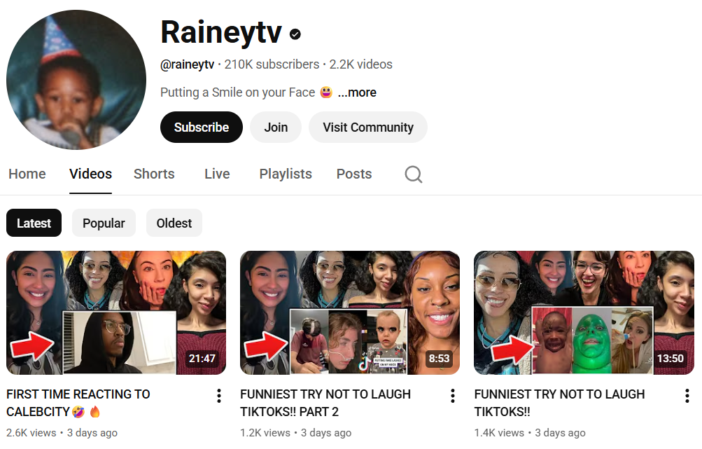
1
RaineyTV was identified as an Outperformer when the channel was still small, standing out through consistency, genuine humor, and a strong connection with viewers rather than raw size. By 2025, that early signal proved accurate, with the channel growing past 200K subscribers while maintaining the same energy that originally drew audiences in.
2
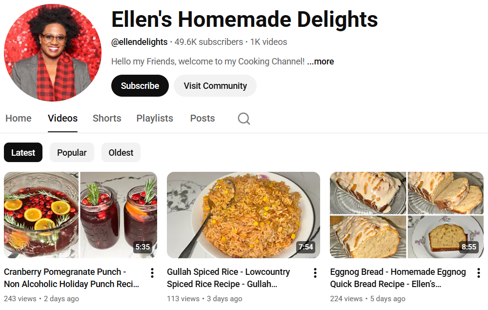
Ellen’s Homemade Delights was never driven by trends, even when the channel had around 10,000 subscribers, focusing instead on clarity, warmth, and practical recipes people actually used. That steady approach carried forward, and by 2025 the channel has grown to nearly 50,000 subscribers through trust and long-term audience loyalty.
3
Super RC emerged early as an Outperformer thanks to focused content, deliberate uploads, and strong viewer engagement despite a modest subscriber base at the time. In 2025, the channel has grown beyond 70,000 subscribers, showing that a clear niche and consistent signal can scale without changing the core formula.

And many more successful channels …
References and Tools
- YouNiverse Dataset — Large-scale YouTube dataset used as the empirical foundation of this analysis, providing channel- and video-level metadata for studying engagement efficiency.
- Google Gemini Nano Banana Pro — Used for generating illustrations of characters.
- GIMP — Open-source image editing tool used to refine and compose visual assets included in the story.
- Plotly — Interactive visualization library used to create some of the dynamic plots.
- ECharts — An open-source JavaScript visualization library used to create some of the dynamic plots.