The Power of Online Communities and the Art of Large Scale Decision Process
How wonderful are the online communities! In the vast landscape of the digital era, the emergence of online communities stands as a demonstration of the transformative power of the internet. This virtual world offers a unique and powerful means for people from every part of the globe to connect and exchange ideas, fostering the development of new tools and platforms from collaborative efforts, of which Wikipedia is a prime example. However, the growth of these communities brings along a new set of challenges related to the organization and management at such a large scale: How can thousands to millions of users make a decision together and agree on common rules and goals?
To address this question, we study the case of Wikipedia, the largest online encyclopedia, which has been built and maintained by millions of volunteers over the past two decades. In particular, we focus on the English Wikipedia, which is the largest Wikipedia edition with 7 million articles and 46 million registered users and for which we have access to a comprehensive dataset spanning from 2003 to 2013, focusing on Wikipedia elections, namely the : “Requests for Adminship” (RfA), as well as a dataset of the number of monthly edits per user over the same period.
The relevance of choosing Wikipedia as a case study is twofold. First, Wikipedia is a unique example of a large-scale online community that has been able to sustain itself over the years and despite its impressive growth. Second, Wikipedia has a well-defined and transparent process for electing administrators with publicly available data, which makes it an ideal case study for understanding the dynamics of collective decision-making in online communities.
To introduce our analysis, let's start by presenting our main dataset: Wikipedia Requests for Adminship. This dataset contains the collection of votes cast for the users applying to become administrators of the platform. We therefore have for each of them (referred to as Target) the list of people who took part in the election (referred to as Source) and their respective votes, accompanied in most cases by a comment from the voter. We also have access to the date and time of each vote, as well as the final result of each election. Using all this information, our first approach was to look at the temporal aspect of the votes.
Voting time and dynamics: How and when are the outcomes of elections settled ?
One first step towards understanding the process of collective decision-making is to study the dynamics of voting behavior over time. In particular, we are interested in the temporal patterns of votes and how they relate to the final outcome of the election.
To extract the timing of votes, we used the timestamps given in the raw data and defined the first vote casted for a target as the starting point of an election round. From there, we wondered if we could extract groups of voters that would vote earlier or later in the election which would be indicative of influential and influenced voters respectively.
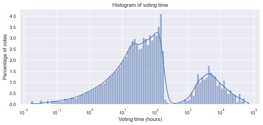
By seeing the distribution of voting times, we were surprised to discover a bimodal distribution (when using a log scale) and in conjunction with our idea of splitting voters into two groups, we were tempted to explain this phenomenon as indicating the actual existence of two groups of voters separated by their voting time. However, after some investigation of the data and looking into the literature about the RfA rules, we quickly realized that this bimodal distribution can actually be easily explained by the fact that some targets that were not elected would be re-nominated and thus would have a second round of votes (or even more). After delving deeper into the data and with the information we found on the RfA process, we were able to define properties of the voting time enabling us to distinguish multiple rounds of votes for a given target. We could also check that the resulting rounds were consistent with the data by extracting some comments coherent with our assumptions, for example:
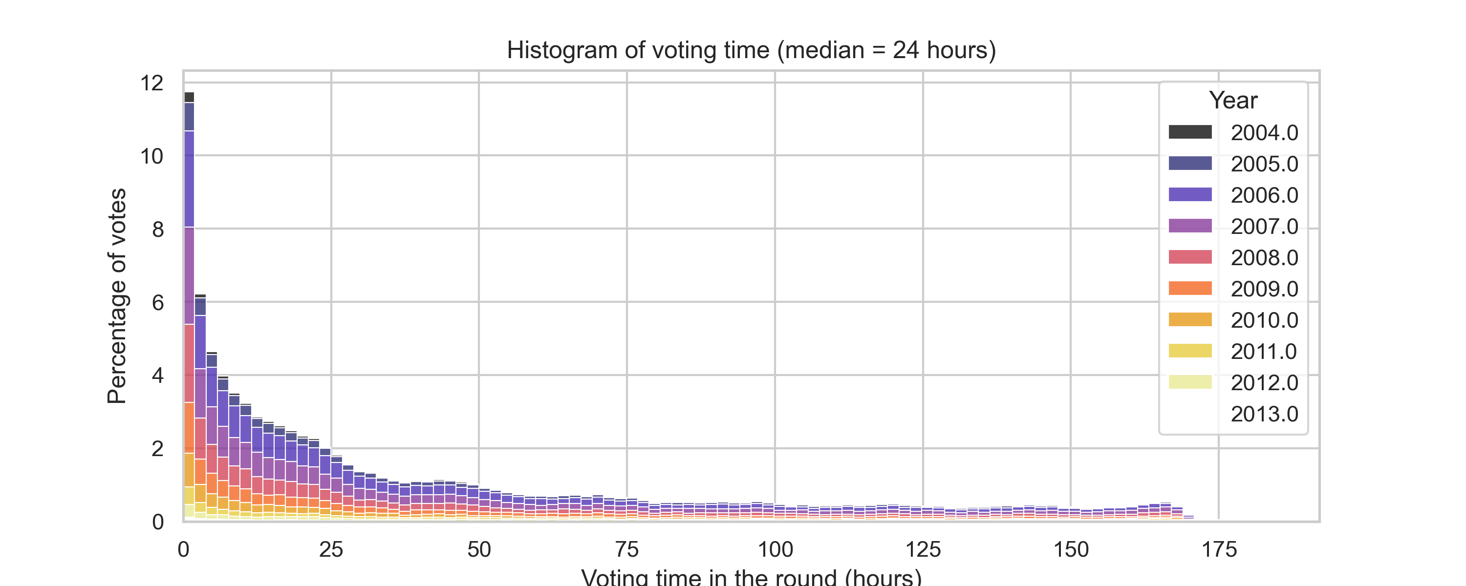
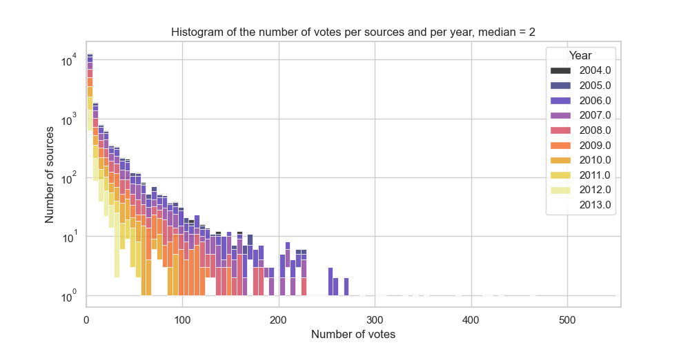
Once this processing step done, we ended up with a heavy tailed distribution of voting times with a median of 2 days, consistent over the years.
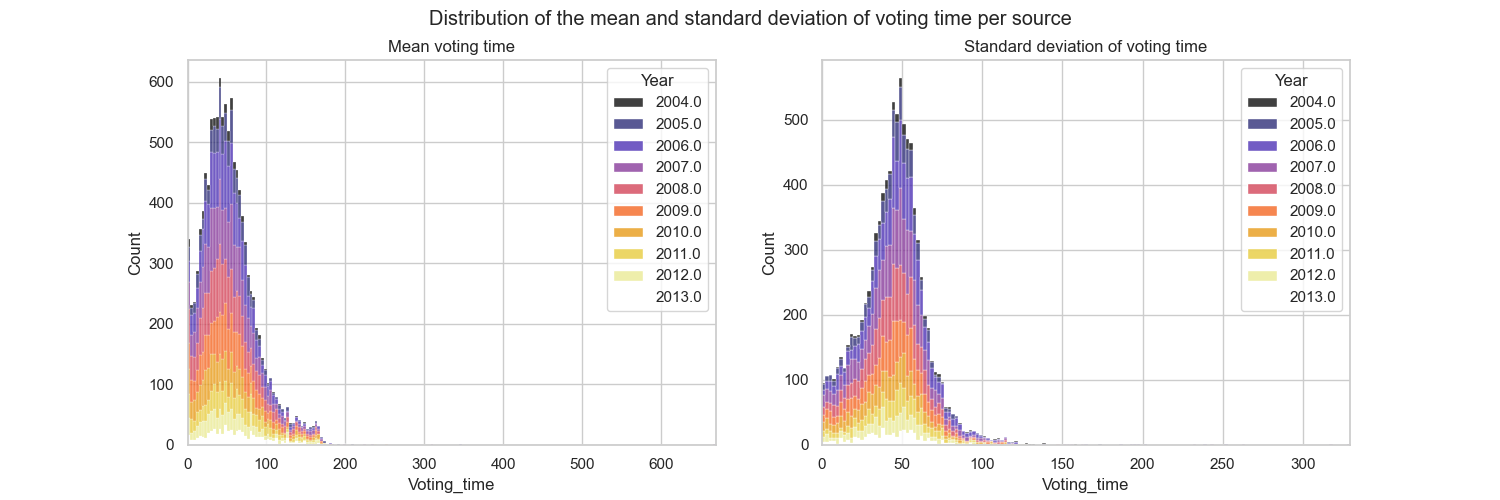
Our attempt at extracting 2 voting groups does not seem to correspond to the reality of votes. But instead of coming to a conclusion too quickly, we preferred to verify our hypothesis by directly examining the behavior of sources. We extracted the mean and standard deviation of each source votes and displayed their distribution.
Once again we get a normal unimodal distribution, such that we can not infer any voting group.
However, despite the fact that we were unable to extract clearly separated groups of voters based solely on their voting time, we still wanted to take into account the fact that not all sources are equally active in elections:
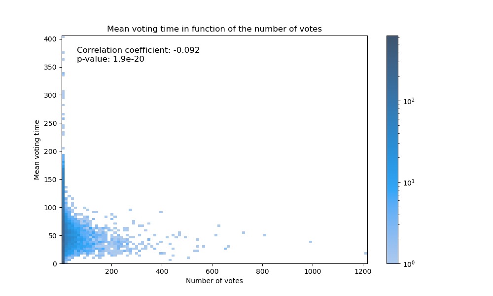
In fact, we can see that the majority of sources only vote a small number of times, and that only a few of them vote a lot, as shown by the heavy tailed distribution. We therefore wanted to check whether by chance the most active sources voted earlier than the others, with the aim of having a greater impact. To do this, we plotted the distribution of voting times of the
sources against the number of votes they cast.
Once again, we observe no meaningful correlation between voting time and the number of votes cast by a source. We can therefore conclude that voting time does not play a decisive role in the process of electing Wikipedia administrators.
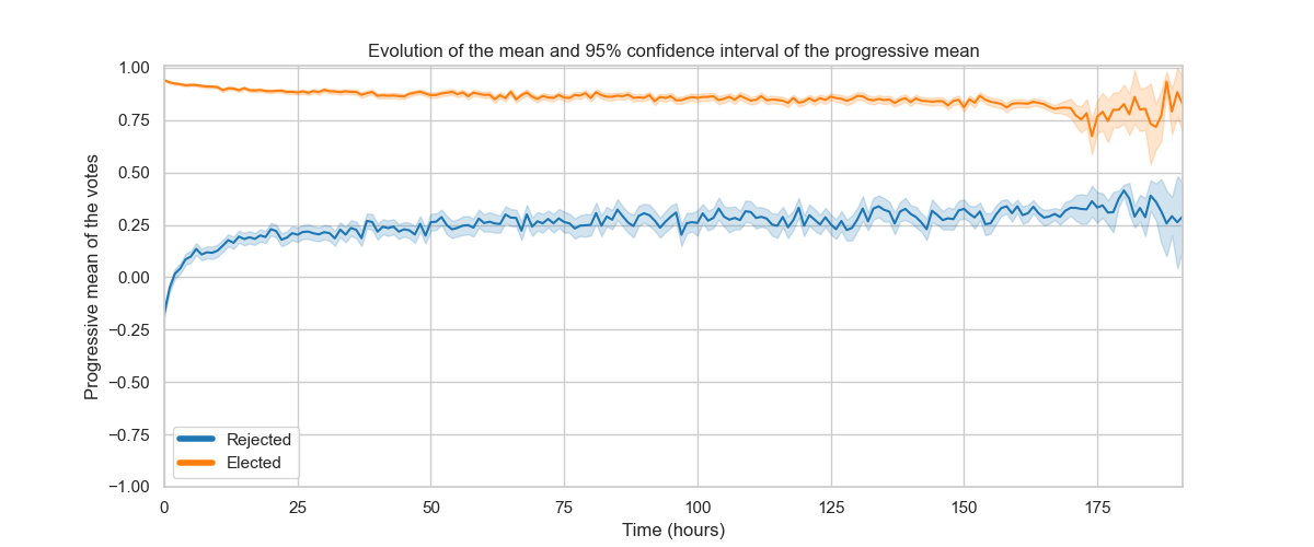
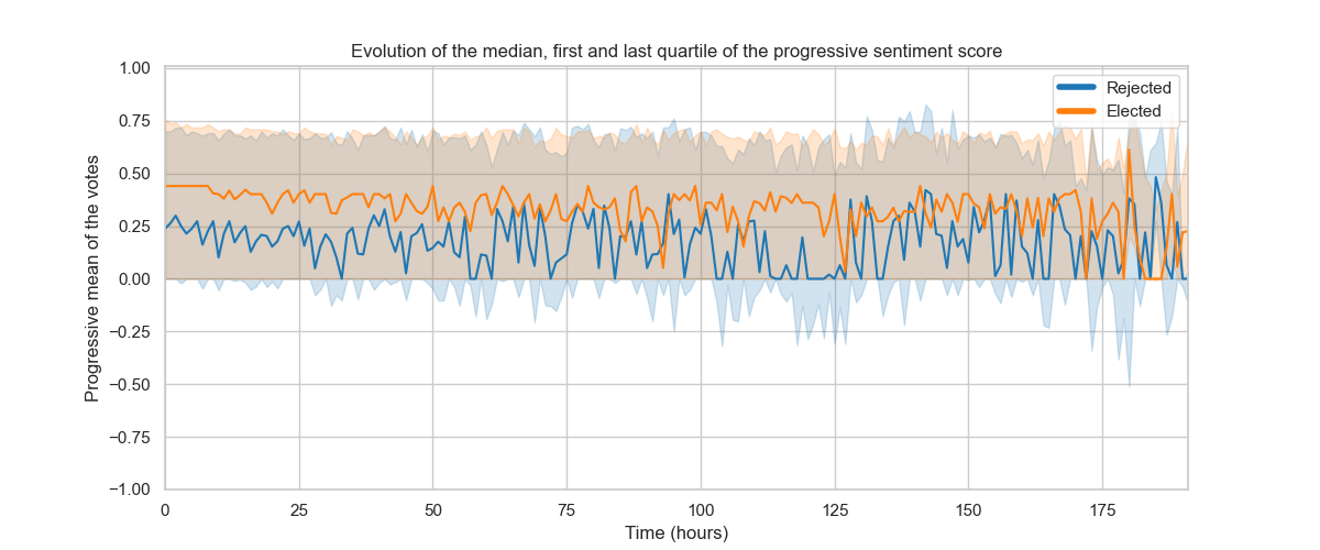
To carry on in the present manner, we decided to focus on votes themselves, in particular on their evolution over time. More precisely, we wanted to know if supporting or opposing votes are homogeneous over time, or conversely if they diverge at a certain point to reinforce the final decision. We therefore computed the evolution of the mean of votes over time and for each election.
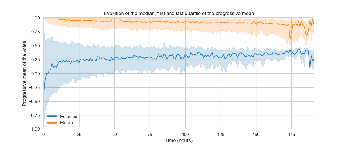
Much to our surprise, we saw that the outcome of an election was in fact determined rather quickly in most cases ! This is suggested by the clear separation of means at the beginning of the election (after aggregating all rounds for all targets) for all successful and failed nominations (left figure). This plot also tells us that the proportion of positive and negative votes was indeed correlated to the final decision of the election, as suggests the absence of overlap of confidence intervals of the means. To go further, we also computed the evolution of the quartiles and the median of votes over time to learn about the dispersion of the trends and it is clear that the distributions are clearly distinct this time as well (right figure), with again a clear gap at the very beginning of the election, that only slightly decreases.
It is therefore obvious that the outcome of an election is determined very quickly and that votes that follow mostly go along with it, only slightly alleviating the initial trend. To go further in this analysis, we implemented a classification model enabling us to predict if an admin will be elected or not only given the first votes input.
We chose to evaluate predictions of our model with the accuracy, precision and recall metrics in order to have a better idea of how predictions perform. Obtained results are consistent with what we observed previously, namely the performance plateau is reached very quickly for the three metrics. By studying furthermore the curve values, we were able to see that the accuracy is relatively high (reaching a plateau at 0.87), but knowing the imbalance in the quantity of successful nominations compared to failed ones (62% of targets are accepted), it is very likely that this metric is biased if for instance the predicted model easily predicts that nominations are accepted. In order to avoid this bias, we preferred to focus on the precision and recall metrics. Given the results, it seems that the model generates very few false negatives, as suggests the recall value that reaches a plateau at 93%, and stays relatively stable, no matter the number of votes considered. Precision on the other hand is very similar to the accuracy, and therefore made us conclude that the errors of the model are mainly false positives.
Interestingly, it seems that in most cases, the first votes input are a good indicator of whether a request will be rejected or not. It is however harder to know with certainty if it will be accepted, since in a number of case, first votes are in favor of requests that will be rejected eventually. This is easily illustrated when looking at the distribution of votes over time for successful and failed requests.
The distributions are in fact clearly different, that is, the rejected requests are more negative than the accepted ones. They still partially overlap however, in particular in the positive part of the voting time distribution.
Two considerations are relevant there :
Firstly, we can successfully predict with such accuracy the result of an election from the first votes input. This makes us think that there is a possibility that the first negative votes influence the following votes, and therefore may determine the election outcome prematurely. It would therefore be interesting to verify if the correlation we observed between the first votes and the final outcome is causal and indicates an influence, or if other factors are implied that can explain both the initial negative trend and the final outcome of the election.
Secondly, for cases in which the first votes are rather positive, it is more difficult to predict the final outcome of the election. This begs to consider the possibility that a vote or a group of votes input later in the election may influence the final outcome of the election.
To effectively answer both these questions and have a more nuanced vision of votes that compose an election, we decided to use comments that are at our disposal. Obviously, comments are a very rich source of information that the votes do not give by themselves as they do not express the intensity and the real intention of a voter. Using comments therefore allows us to have a better view of votes and that way maybe be more nuanced in our analysis.
Our first approach to use comments was to perform a sentiment analysis on the comments in order to extract the polarity of each comment so that we have an idea of the intensity of votes, since such an analysis generates a continuous value score between -1 and 1 for a given text, -1 meaning the text is totally negative, neutral if it is 0, and totally positive if it is 1.
We can already see that the majority of comments are neutral and that positive comments are more frequent that negative comments. To go further, we decided to see if those proportions were constant over years.
On these graphs we see a quite surprising result. We were expecting that the proportions of positive and negative comments stay constant over years, but it seems that it is not the case. In fact, we observed over years a clear decrease of the number of neutral comments for the benefit of positive and negative comments. This leads us to believe that over years, voters are more and more prone to express their opinion more decisively in the comments, which is at our advantage since it enables to get more information on the reasons that motivate voters to vote for or against a certain request, and thus have a better view of which parameters are implied in the decision process.
From this new data, we decided to reproduce previous analyses by using sentiment analysis scores instead of votes, while hoping to get more pronounced results that what we got so far. Unfortunately, we quickly realized that sentiment scores were not polarized enough to give us more distinct results than what we already had.
As can be seen on the figure above, the trend curves are way too close to get any relevant conclusion, despite that the accepted requests are effectively slightly less positive than rejected requests. We can still note that the values dispersion is bigger with sentiment scores than votes despite that, with most comments being neutral, we were expecting to have closer values instead.
In the end, we had to accept that the distribution of sentiment scores over time was mostly the consequence of the score distribution, and not a consequence of the success or failure of a request.
But this failed attempt did not stop us ! We still wanted to investigate comments in other ways. In fact, we realized that the positive or negativity of comments is not a relevant factor to take into account, and that the reasoning behind votes is more complex. We then decided to look at the semantics of the comments. In particular, we used topic modeling in order to extract the main topics of the comments and have an idea of what is discussed in the comments.
Topic analysis: What are the decisive aspects of the decision-making process ?
In this part of the analysis we want to focus on understanding what matters the most in influencing the result of an election, by using the comments that voters may write while casting their votes.
To do so we used topic modeling to see what topics are more prevalent amongst the comments. We use the Latent Dirichlet Allocation (LDA) algorithm to extract the topics. The prevalent hyperparameter of this method is the number of topics we want to extract, the number of latent dimensions. The LDA algorithm outputs, for each comment, the proportion of comments that can be attributed to each topic. And for each topic of the model we have the list of words, for each topic, with the likelihood of each word's association with that particular topic.
We chose to conduct the analysis for respectively three, five, seven, nine topics, to cover the maximum of the possible range given that comments are not very long - the median of the number of characters is 84 for a maximum length comment of 5638 characters.
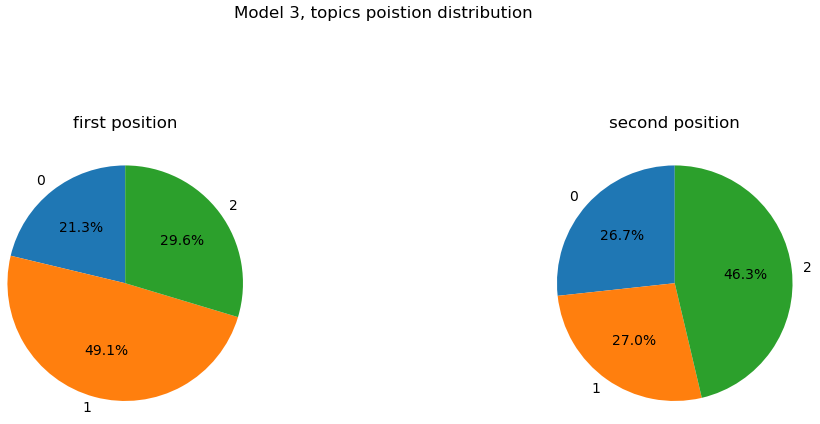
Model with 3 topics:
First the three topics model with its topic word representations (we only show words with a coefficient of participation in the topic bigger than 0.01 as for the rest of this analysis):
The topic 0 composition: support (0.287), — (0.030), good (0.016), strong (0.015), small (0.014), … (0.013), look (0.013), thought (0.012), course (0.011), yes (0.010), solid (0.008), nom (0.008), nominator (0.008), reason (0.007), (0.006)
The topic 1 composition: oppose (0.037), edits (0.017), user (0.012), edit (0.010), time (0.010), vote (0.009), wikipedia (0.009), neutral (0.009), page (0.009), month (0.008), article (0.008), admin (0.007), like (0.007), think (0.007), experience (0.007)
The topic 2 composition: support (0.100), good (0.058), admin (0.037), user (0.029), editor (0.024), work (0.019), great (0.018), tool (0.012), ‘ve (0.012), seen (0.011), contributor (0.011), like (0.010), excellent (0.009), wikipedia (0.009), strong (0.009)
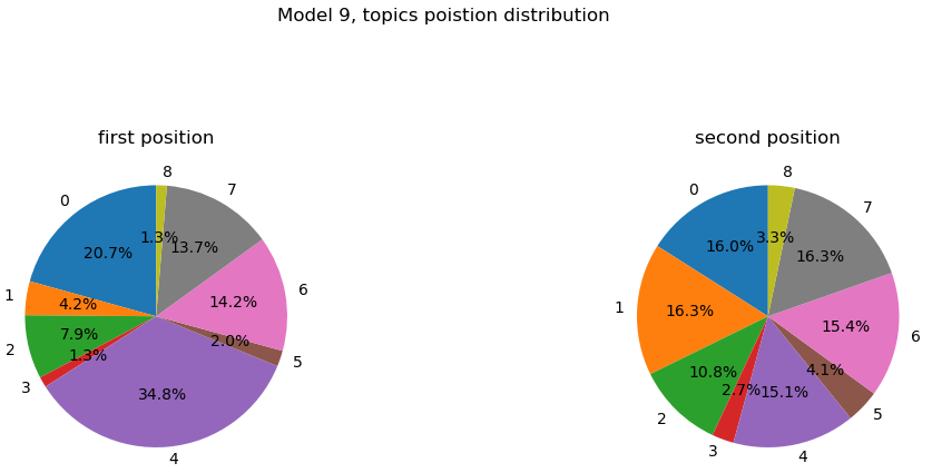
Let’s see the distribution of the position of each topic for a given comment.
Remark: Please remember that the LDA algorithm outputs for each comment the list of topics coupled with the probability of the topic to match the comment. When ordering this list in decreasing order we obtain in first position the best topic for a given comment. Below, and for the rest of the topic analysis, you will have the proportion for the topics to be in first or second position in these lists.
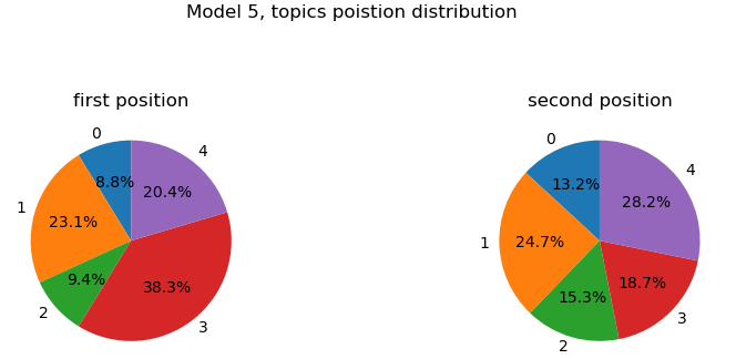
Model with 5 topics:
Second the five topics model with its topic word representations:
The topic 1 composition: admin (0.016), user (0.015), think (0.012), vote (0.009), people (0.008), thing (0.008), adminship (0.008), ‘ve (0.008), time (0.007), wikipedia (0.007), like (0.007), editor (0.006), way (0.006), know (0.006), powe (0.005)
The topic 3 composition: support (0.302), good (0.060), admin (0.026), user (0.024), editor (0.020), great (0.019), strong (0.017), — (0.013), work (0.012), excellent (0.012), contributor (0.011), look (0.010), like (0.010), seen (0.010), too (0.009)
The topic 4 composition: edits (0.047), edit (0.026), wikipedia (0.026), oppose (0.025), user (0.022), need (0.019), good (0.019), article (0.018), experience (0.018), admin (0.017), work (0.014), summary (0.012), contribution (0.011), like (0.010), polic (0.010)
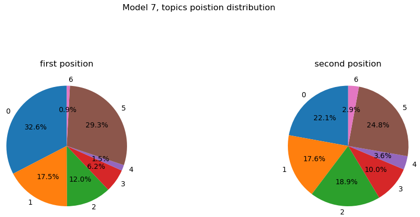
Model with 7 topics:
Third the seven topics model with its topic word representations:
The topic 0 composition: admin (0.017), think (0.014), people (0.011), time (0.010), adminship (0.010), wikipedia (0.010), like (0.010), thing (0.009), vandal (0.009), admins (0.009), need (0.009), know (0.008), way (0.007), editor (0.006), use (0.006)
The topic 5 composition: support (0.147), good (0.071), admin (0.041), user (0.038), editor (0.028), great (0.025), work (0.020), seen (0.016), contributor (0.015), ‘ve (0.015), tool (0.014), excellent (0.013), strong (0.012), like (0.011), candidat (0.008)
Model with 9 topics:
Fourth the nine topics model with its topic word representations:
The topic 0 composition: support (0.083), good (0.030), ‘ve (0.026), wikipedia (0.023), seen (0.021), work (0.020), summary (0.020), admin (0.017), user (0.017), editor (0.016), need (0.015), great (0.010), admins (0.010), lot (0.010), us (0.009)
The topic 4 composition: support (0.305), good (0.071), admin (0.035), user (0.030), editor (0.024), great (0.022), strong (0.021), look (0.015), excellent (0.014), contributor (0.014), like (0.013), tool (0.013), course (0.009), fine (0.009), abus (0.009)
We see that the more represented topics (top 1-2) across all the models are always strongly linked to words related to edits and what seems to be the quality of these edits.
For the model with 3 topics, the topic being nearly 50% in first position for a given comment is mainly composed of “support” and “good” (10% and 5.8%) and quickly after “editor”, “work” and “contributor” (2.4%, 1.9% and 1.1%).
For the model with 5 topics, the most relevant topic is the 3rd (38.3%) followed by the 1st (23.1%) and 4th (20.4%). The 3rd topic is equivalent to the first topic from the model with 3 topics. The 1st topic (model with 5 topics) seems to be quite general with top words being (in order): ”admin”, “user”, “think”, “vote”, “people”, … Nonetheless there is a mention of “editor” with a topic representation proportion of 0.06%. On the other hand, the 4th topic is mostly composed with “edits”, “edit” (note that it is strange since both of them should be mapped to the same root word, but it does not affect our observation too deeply), “wikipedia” and “oppose” (4.7%, 2.6%, 2.6%, 2.5%). We see again the prevalence of topic related with “edit(s)” but on the contrary this topic is related with “oppose” rather than “support”, so we observe that the “edit(s)” related topics are present in both support or oppose side of the vote, which may indicates a special importance with respect to the election result.
For the model with 7 topics, it is less clear but we can see in the 5th topic (one of the most relevant topics with equality to 0th topic) that we found again description words like “editor”, “work” and “contributor”.
For the model with 9 topics we see that the most appearing topic in first position (the 4th) is also composed of words referring to edits and work done: “editor”, “contributor” and “tool” (2.4%, 1.4% and 1.3%). The second most appearing topic in first position (the 0th) is positive and also has work related words and edit theme references.
Generally speaking, it seems that the most prevalent topics among the models all refer to the activity and amount of work provided for the nominees as editors on the platform. This information is particularly interesting in the sense that it reveals that a key aspect motivating source votes is very concrete and objective. To find out more about how closely this observation actually corresponds to the reality of the facts, we're going to explore user activity on Wikipedia in greater depth to link it to the elections with the help of a second dataset.
Users activity: a concret factor shaping the election outcomes
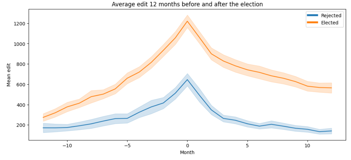
Let’s see if the number of edits is really an important feature for a target to be elected. To carry out this study, we found a dataset listing the number of edits made by users in each month spanning the same period as our original dataset. Looking at the average number of edits made by targets in a 1-year period before and after the result of their last election, we observe the same inverted V shape, with the point indicating the election results, for people who were elected and rejected. Nevertheless we observe a significant difference between the two groups in terms of average number of edits, confirming what we had observed to be an important theme in comments across all years.
But couldn’t voter activity on the platform also be a factor of influence?
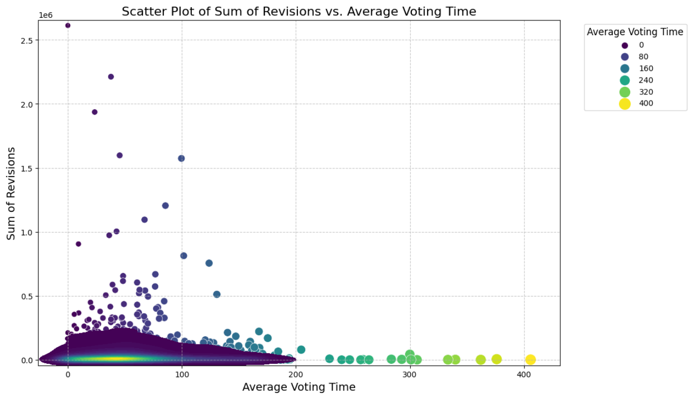
Now that we've identified the significance of the number of edits for target users, the next question is whether this factor also influences source users. To explore this, we investigated whether individuals making the most revisions were also among the first to vote, potentially indicating a greater influence. To do this, we created a plot showing the total number of users against the average voting time for these users.
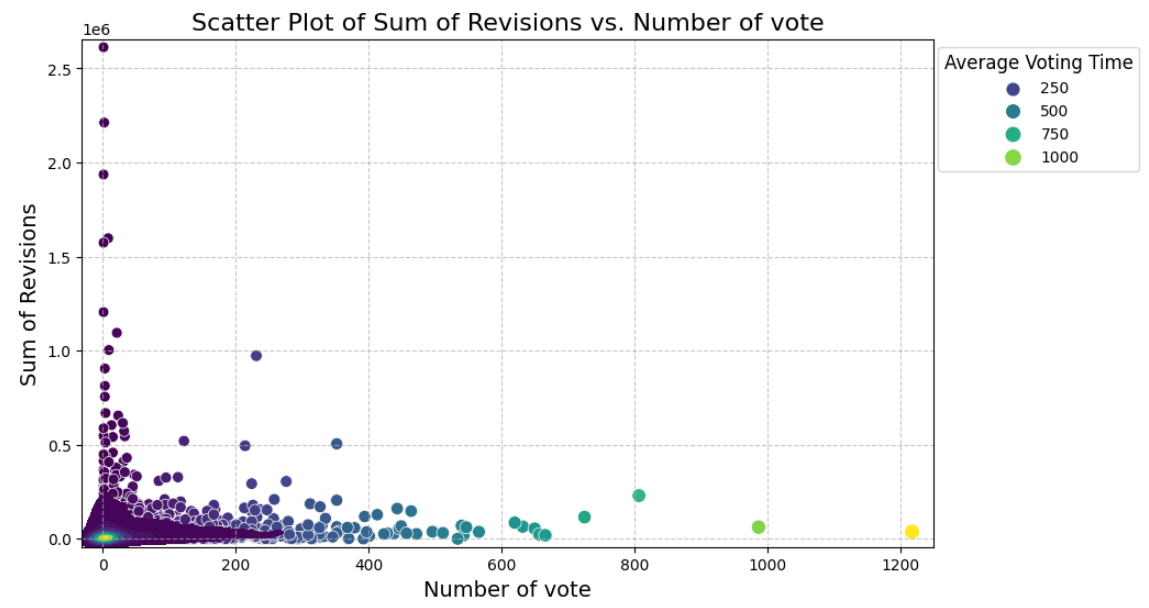
Upon analysis, we noticed that the majority of data points cluster in a specific area, suggesting few edits for a relatively low voting time. As voting time increases, the number of edits tends to decrease, which aligns with expectations. However, some users who vote early exhibit an unexpectedly high number of revisions. To verify this finding, we further examined the relationship between the number of revisions and the number of participations in votes.
In the subsequent graph, we observed that these points lack significance due to users participating only once in an election. Consequently, drawing conclusions about the influence of individuals making numerous revisions from these graphs is challenging.
Sub-communities of a large community, or how a population breaks down into groups by similarity of opinion
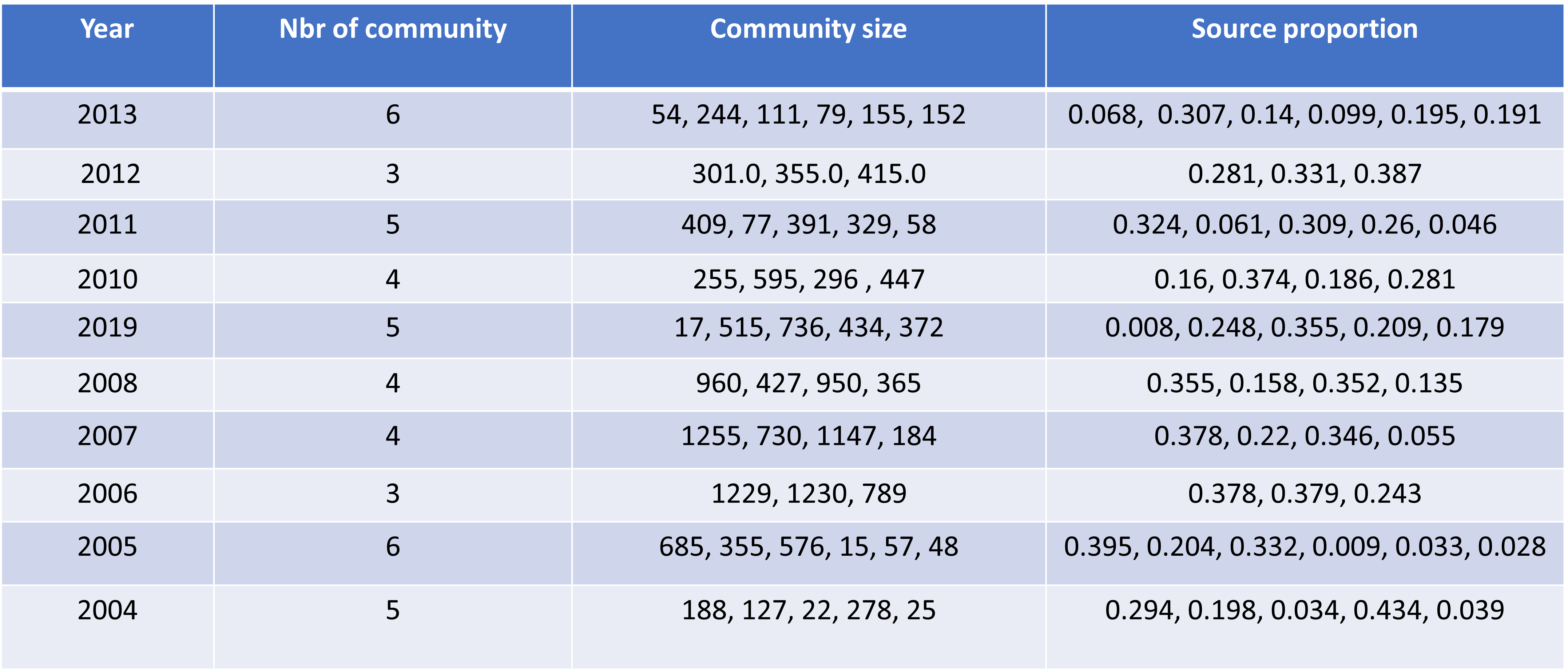
To see if any features stand out within communities, we created a weighted projected graph by grouping together sources that voted the same way for one or more targets, then extracted communities using Louvain's algorithm. Communities are extracted by year, so that we can study the variation in the characteristics of each one over time, with some perhaps standing out at a specific period that we wouldn't have noticed with a more global view.
Overall, the number of communities per year varies between 3 and 6, and their size fluctuates between less than 1% to over 40% of the year's sources, with the majority having high percentages.
In the following, we will analyze some of the larger communities and focus on smaller ones, where we expect to see more pronounced behaviors/characteristics, less smoothed out by the large number of people.
What characterizes these communities, and what can we learn from them?
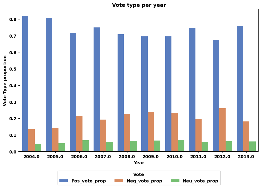
In order to have a reference point when studying the communities, and also to be able to check that there is no variation within the years themselves, which could induce a bias in our analyses, we began by extracting the proportions of positive, neutral and negative votes for each year.
We see here that the voting proportions are indeed relatively constant over the years, and that there is no evidence of any significant change in voting behavior over the years. We can therefore use these proportions as a reference point for our future analyses.
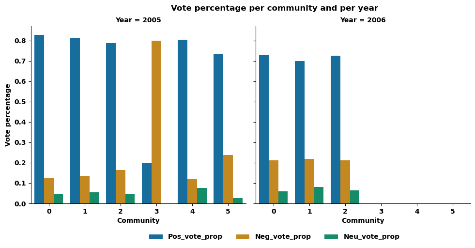
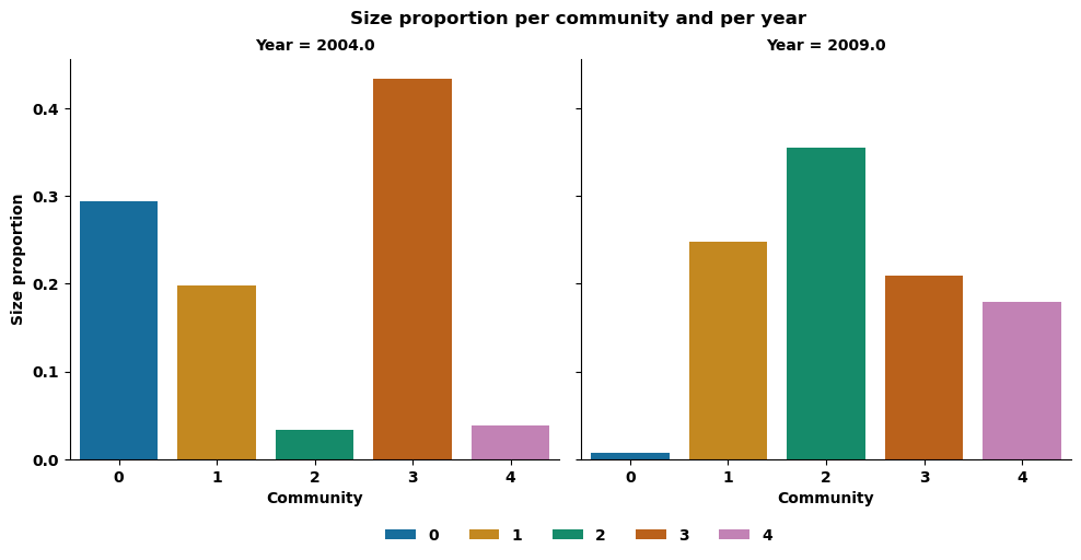
Let's now focus on the behavior of communities: Note that we have larger ones, such as those in 2006. It includes 3 communities representing respectively 37%, 37% and 24% of the number of sources having voted that year. And we also have smaller ones, for example, those of 2005, which includes 6 communities, 3 of which represent less than 5% of the total number of sources who voted that year (respectively 0.9%, 3.3% and 2.8% for communities 3, 4 and 5 of this year).
If we look at the percentage of vote by type of vote (positive, negative or neutral) for these communities, we observe a very large majority of positive votes, approaching 80%, a smaller proportion of negative votes, close to 15-20%, and a smaller proportion of neutral votes, close to 5% for the year 2006 and generally for the year 2005, in line with the general voting behavior observed previously. However, a closer look at community 3 in 2005 reveals a different pattern. This small community has a percentage of negative votes approaching 80%, while positive votes are close to 15%, suggesting a different voting dynamic.
Let's see if these differences are also observed in other voting features of these elections.
Let's look at community voting time, for example. Generally speaking, the median voting time for 2006 varies between 15 and 25 hours. Similarly, for the larger communities in 2005 (communities 0, 1 and 2), the time varies between 20 and 30 hours, while it is less than 1 hour for the smaller community 3, indicating that it votes very quickly, and close to 40 hours for community 4, indicating a more pronounced voting delay. So, once again, it seems that smaller communities have a more fluctuating voting time dynamic than larger ones.
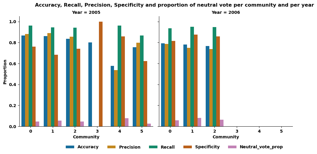
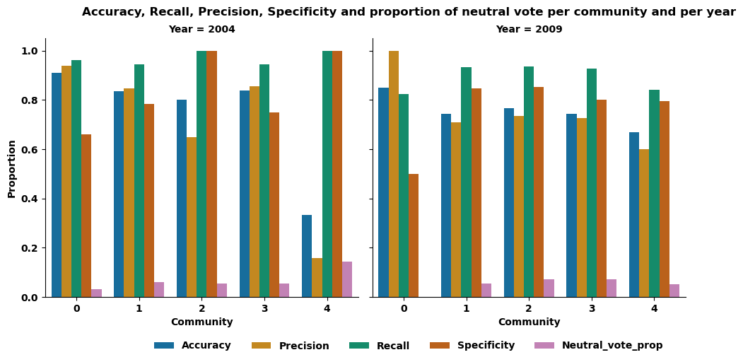
Finally, let's see if certain communities are more in agreement with the election result, in other words, if the vote of these communities is in agreement with the election result. To do this, we looked at a variety of metrics, including accuracy, precision, recall and specificity. For the year 2006, as well as for the large communities (0, 1, 2) of the year 2005, we observe that the value of each metric is relatively constant, between 0.8 and 0.9, across the communities of their year.
On the other hand, for the smallest communities in 2005, the values are more dispersed. In particular, community 3 has a specificity of 1, an accuracy remaining close to 0.8, while recall and precision are equal to 0, indicating that each time this community votes negatively, the election result is also negative, while maintaining an accuracy in the same order of magnitude as that generally observed, meaning that the "quality" of their vote prediction is not altered. The zero value of recall and accuracy indicates that the positive votes of this community were not in agreement with the outcome of the election. Thus, it is possible to distinguish the small size community, 3, of the year 2005 by its characteristics, whereas the larger communities of the same year or those of the year 2006 seem to share more common features, and it therefore seems difficult to distinguish them based on the characteristics studied.
So far, we've only highlighted remarkable features of one small community, so we might ask whether the highlighting of these remarkable features is unique to that community. Let's see, for example, whether the prediction of election results stands out for certain communities, and whether these communities are small in size.
Extracting the distinctive features, we can see that communities 2 and 4 in 2004 have a specificity equal to 1 (as does community 3 in 2005), meaning that when these sources vote against, the election result is also negative - these communities can be described as "negative but fair". By checking if those results are accurate based on the revisions’ number of the user, we have seen that, in most of the cases, users have no activity prior to their request, justifying a negative result. But for Community 2 in 2004, the rejected user had a large enough number of revisions to justify validation rather than rejection, while others were validated by this same community with no revisions. This raises a pertinent question: why was this user rejected when others with no revisions were accepted? The answer may come from revisions not mentioned in our dataset, or from other more subtle reasons such as the topics covered by these users. Community 0 in 2009 has a precision of 1, meaning that as soon as it votes positively, the election result is also positive, so it could be described as "nice but fair". Finally, community 4 from 2004 has a low precision value, even though it has a high recall. This means that this community mostly votes positively, but too often for this to be done accurately.
Now let’s see if the communities mentioned are indeed small.
We can see that all these communities are actually small, confirming the observation made earlier that more features can be extracted from small communities, as these features are smoother and therefore less visible in larger ones.
Continuing our exploration of communities, we investigated whether specific communities (large and small) exhibited higher activity in making revisions. Our initial analysis revealed minimal variations among communities, with the exception of 2004's community 4. Generally, communities demonstrated equal engagement, averaging between 3000 and 5000 revisions per user per year.
To gain deeper insights, we shifted our focus to individual users within communities and their potential influence based on voting behaviors. Examining graphs for the top 10 users in terms of revisions within communities, we uncovered significant disparities. Some users made well over 150,000 page revisions, while others contributed only a few thousand.
However, when we factored in their voting time, a key element in understanding potential influence in future vote, we found no substantial differences compared to other users. Once again, our analysis suggests that when assessing a user's influence on others, clear patterns are elusive.
Despite the distinctive features observed within these small communities, it is legitimate to question their representativity as voting sources. It could be that our community extraction algorithm has grouped together only the most extreme individuals within a given community in a given year, and with source votes spanning several years, it is pertinent to ask whether these communities are not in fact small entities independent of the voting process aimed at electing administrators for Wikipedia.
The evolution of communities, or how groups spread and divide over time
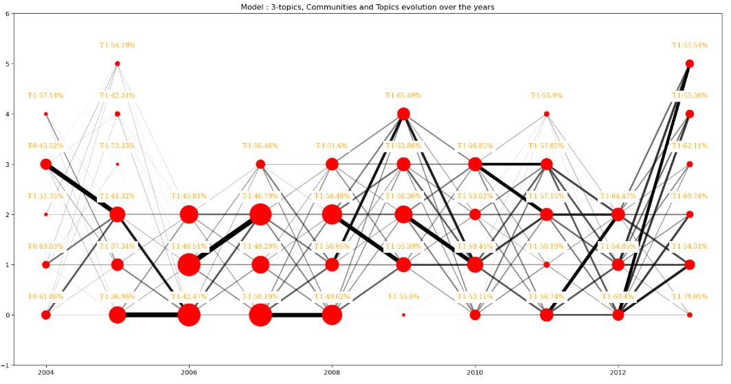
Considering communities individually is important for understanding what characterizes them and extracting more precise and specific factors within elections. However, it's also important to remember that communities are part of a whole, and that they evolve over time, just as the platform grows over time. We therefore felt the need to analyze the link between communities over time. To do this, we chose to measure the similarity between communities in each successive year using Jaccard similarity, which allows us to measure the similarity between two community source sets.
In the following graph nodes are communities arranged by year, their size represents the number of sources in them. Edges represent the similarities with their width and transparency. Thick and opaque mean big similarities.
The first particular thing we can observe in the above graph is that the sizes and number of communities greatly varies between years, most of the time communities do not last through years - there does not appear to be sources that consistently constitute a community together through several years.
Communities seem to be more "stable" from 2004 to 2007, there are really thick links between some communities in this period of time. On the other hand, on the opposite side of the graph, links are of the same thickness, for example the community 2 of year 2012 is connected the same way to the communities of 2013 - in comparison with the community 0 from year 2005 with the ones from 2006.
This “stable” state from early years that faded out in such ways that communities are more “fluid” in their evolution can be explained by one of our previous observations: the number of source’s vote. Indeed, there is in proportion more votes in the early years of our dataset than in the last years. Since our communities are based on similarity of voting choices, if they do not vote for the same target (because they do not vote for a majority of the election) they cannot be part of the same community.
These observations seem to underline the fact that there would not be stable groups of voters that vote the same way, at least in the latest years.
Now let’s have a closer look at the topics’ evolution. Starting with the model of 5-Topics we have :
Here we can see that even if we have a prevalent topic (3rd one) over all comments, the second most dominant one appears to be the first for some communities. For some, it's even a relatively infrequent topic that emerges as the dominant one, in 2004 and 2013 namely. What is interesting is that they both have many communities.
So we may think that having many communities is linked with having many topics and different central criteria to vote.
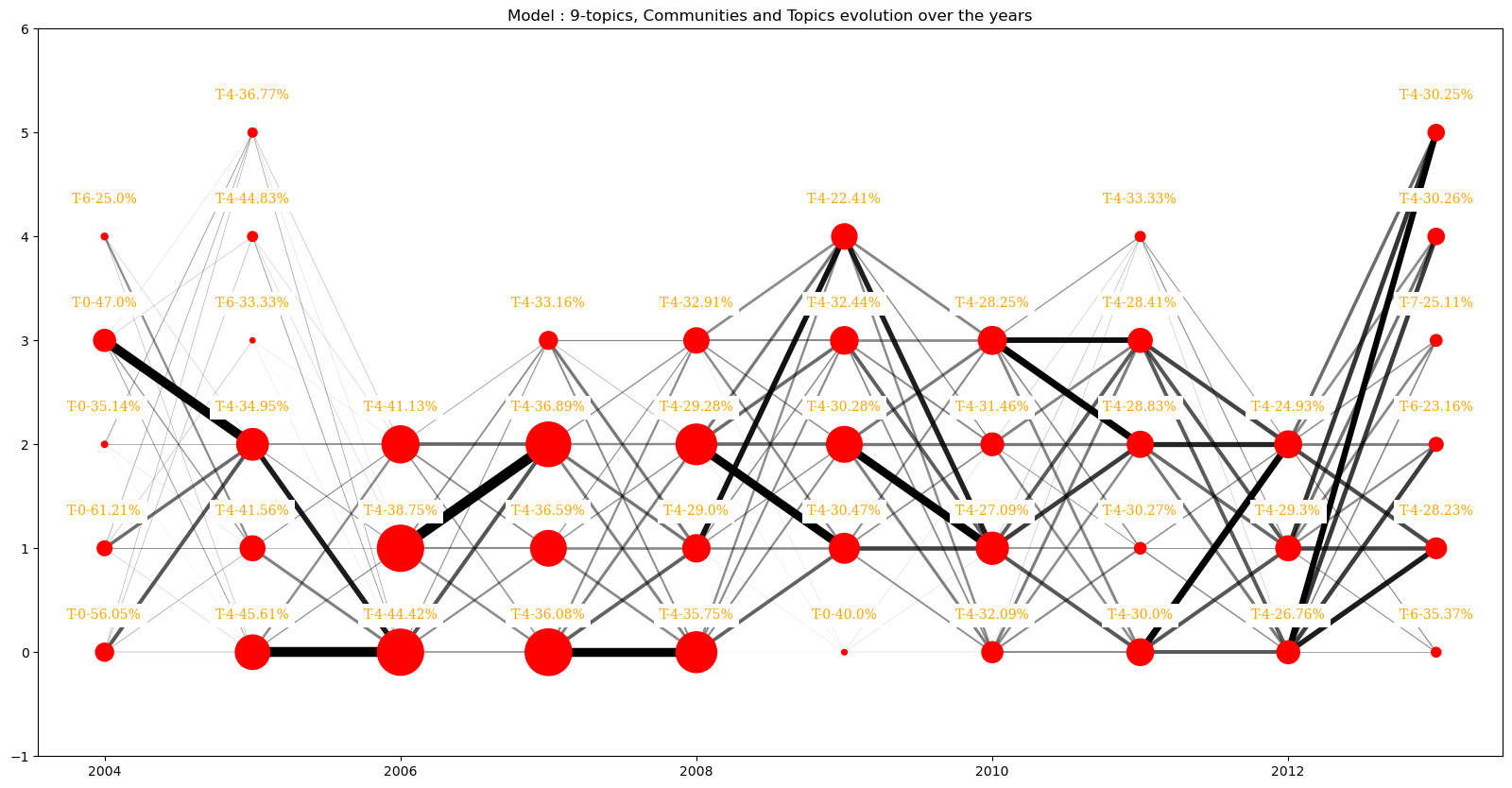
First let see if this observation is not directly correlated to the number of topics of the model with plotting the same graphs as above for the 7-topics and 9-topics models
We see that the same patterns arise for the model with nine topics but not with the 7-topics models. But the 9-topics model does not seem to amplify the number of different topics dominant inside communities.
Time for conclusions: what can we draw from all these considerations?
Our exploration of Wikipedia Requests for Adminship (RfA) elections through data analysis has brought to light several key insights. While we failed to identify distinct groups of voters based on voting time, we were able to uncover a pretty clear correlation between the first votes cast and the final outcome of the election. But what does this correlation mean? Is it indicative of a causal relationship? Or are there other factors at play that explain both the initial trend and the final outcome of the election?
To answer these questions, we delved deeper into the data, exploring the comments left by voters in an attempt to understand the motivations behind their votes. What emerged from this exploration is one specific aspect that we believe is crucial in understanding what shapes the decision of accepting a new admin or not: the quantity of edits.
With this in mind, we decided to explore the number of edits per user over time and check for any correlation between election and activity on the platform. And indeed, we found significant influence of the number of edits on the elections. This metric likely serves as a tangible indicator of a user's involvement and impact within the Wikipedia community, hence its importance for being accepted as an admin.
This discovery led us to reject our initial hypothesis of a potential source of influence in the voters, and instead speculate that the only factor that matters is a factual and objective assessment of the user's activity on the platform. However and with the aim of not being too hasty in our conclusions, we decided to take a closer look at smaller groups of voters, in the hope of finding some evidence of influence that could be masked by the overall trend. In this regard, we extracted communities of voters based on their votes and analyzed their behavior again.
But this new approach, while revealing new considerations and some singular patterns, didn't lead to conclusions that couldn't be explained by our previous findings. In the end, it might seem that this is exactly what has enabled Wikipedia to maintain stability despite its considerable growth: the ability of its community members to make decisions as objectively as possible, taking into account concrete factors rather than a game of influence and who's the strongest.