The evolution of awareness over time
CoronaWiki
To begin, we will consider the following: an increase in the visits to a given topic corresponds to an increase in awareness
for that particular topic. Here, we are talking about increases that are more or less unique to that subject itself, i.e if
all topics increase in view counts at the same time, we can't say much about the awareness related to a topic in particular.
Let us note that all Wikipedia data in Coronawiki is encapsulated in 64 topics, in which environment articles are concentrated
in only one of them (STEM.Earth and environment). As such, the orders of magnitude between the views from only that topic and the rest
of Wikipedia are very different; whenever we need them to be compared, we will scale them to be between 0 and 1, where 1 represents the
peak of each series.
As a first general result, we can have a quick look to check if all Wikipedia views evolve differently from environmental views during
the first 2020 Covid wave. We do that by plotting the trends of both time series using a period of 14 days.
At a quick first glance, one can see that until the first half of March, the two don’t evolve in the same way: it appears that the
environment views reach their maximum in the earliest part of 2020, after which it decreases until the middle of March. Following that,
it appears to have a similar trend to the general trend of global Wikipedia views. However, this is the data in its most coarse grained
and general form; we have to do a lot more analysis by considering each language separately (English does dominate the data after all),
and by using the 2019 data as a way to compare with normality. Note that we map most of these languages to the countries/cities where
they are the most used (not feasible with English)
Difference in difference regression
In order to be more precise, and to better determine the effects of lockdowns and mobility changes on environmental visits, we do what
is called a Difference-in-difference regression: basically, it is a type of regression that uses the concept of control and treatment
groups, simulating an experimental design with observational data. Here, the treatment would correspond to certain mobility changes in
2020, and we take the same dates in 2019 as control. For each language and date (mobility restriction/return to normal), we take a window
of 5 weeks for the data.
The goal is to separate the effects of the mobility changes from seasonal changes, i.e. changes that happen every year around the same
period of time.
As the outcome, we use the logarithm of the environmental page views; the range views vary greatly depending on the language, so the
logarithm mitigates that; plus, it makes the model multiplicative, and facilitates the comparison between languages. As variables,
we use is_2020 (self-explanatory), language (clear what it is as well), and period (whether we are in the chosen treatment group
for that comparison or not).
The R formula for these regressions is:

Three comparisons are made for each language:
-
The difference in environment visits before vs after the mobility restriction, as to see the immediate effects
-
The difference before the mobility restriction vs after the return to normalcy, to see if similar mobility necessarily mean similar visits
-
The difference after the mobility restriction vs after the return to normalcy, to see the evolution as restrictions were lifted little by little.
The results are in the following three figures; note that the values are actually exponents, and so they correspond to a multiplicative effect
when applying the exponential function.
The changes are not unfortunately all statistically significant; the languages with red confidence intervals are those for
which we can’t derive conclusions. Let us go figure by figure now:
-
For the pre-vs-post mobility changes, half of the changes are not significant. We see a general increase that can range from 116% for
Japanese, to 224% for Serbian (for this language though, it is sure to be because of political confounders other than Covid).
-
For the pre-mobility vs post-normalcy comparison, the changes are now statistically significant for a majority of the languages;
and interestingly, despite the same mobility in both periods, there is a drop in views for most of the languages after the return
to normal.
-
Lastly, the post-mobility vs post-normalcy one corroborates the two other regressions: on average, post_mobility > pre_mobility,
and pre_mobility > post_normalcy => post_mobility > post_normalcy.
At this point, one might tell themselves that this in itself is enough as an analysis; people may have cared more during the first wave,
but they stopped caring after restrictions were lifted. But that isn’t satisfying as a result in itself; we need to look at the question
from multiple angles. As such, let us push the analysis further. Let us get more precise, by looking at the level of the languages;
remember that in the first figure we just took all languages together, now we will separate them: we want to see if the
increases/decreases in environment views are proper to the topic itself, or whether they just follow the general Wikipedia trend.
If we do find different behaviors, we can then study them closely and maybe find periods where for example the global views have a
downward trend and the environment views have an increasing trend, and this might mean that during that time we have an attention shift towards the environment.
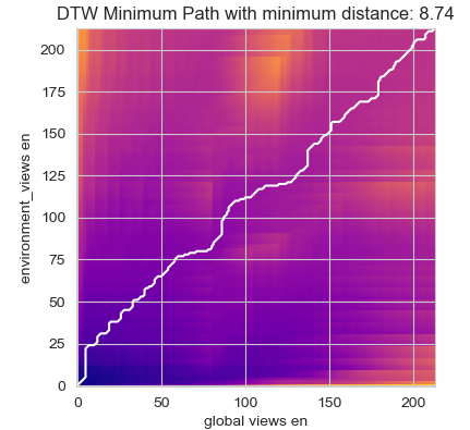
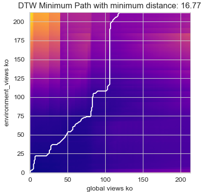
Dynamic Time Warping
Dynamic time warping (DTW) is a way to compare two usually temporal sequences that do not sync up perfectly. It is a method to calculate the optimal
matching between two sequences. It’s commonly used to measure the distance between two time-series. We will, for each language, apply this algorithm
between the environment-related views and all views for that language. Examples of results are below, you can find the graph for every studied country
in the appendix.
For Italian, Norwegian, English and Dutch, the time series are really close to each others, and because the shortest path is
really close to the matrix diagonal, we can say that the time series are behaving similarly (up to the scales of the values and time dilation).
This may indicate that the evolution in environment views and Wikipedia views may behave very similarly.
For some of the other languages (Korean or Swedish for example), the distances on one hand are higher than average, and the plots are very far
from being lines. This means that DTW didn't find a mapping that is even close to one-to-one for most of the points, i.e., the environment views
and the total Wikipedia evolution for these languages are different.
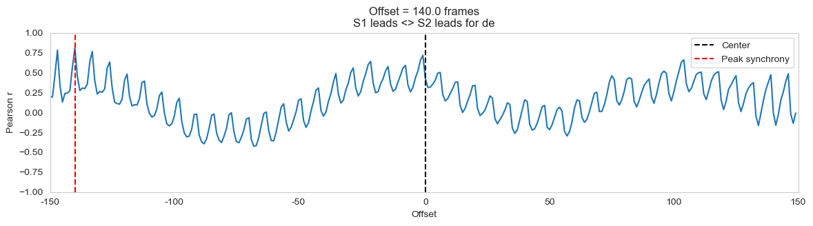
Time lagged cross correlation
Time lagged cross correlation is meant to add to the above analysis; it studies the correlation between the two time series by shifting one
of them positively or negatively in time, as to see if we can obtain one from the other that way. The closer the peak synchrony is to 0, the
more synchronous the time series are; the contrary is also true, and this is what we tried to look for. Two examples of outputs are below, you can find the graph for every studied country
in the appendix.
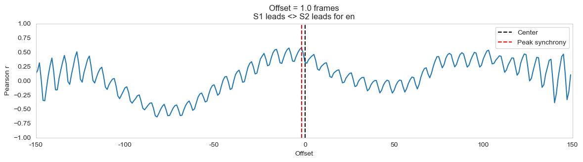
Again, the results are unanimous for a lot of languages: apparently, people’s environment visits are often simply synchronized with
their visits to other Wikipedia topics (example of the first figure).
Some outliers exist : such a case here is Germany, for which an offset of 140 has a Pearson coefficient of 0.75, meaning that the wikipedia
views at time almost “overlap” with the environment views at time. Meanwhile, for most of the other languages (Serbian, Catalan, French,
Italian, Norwegian, ….), the offset that maximizes the cross correlation is 0. As such, we cannot really conclude much as the Wikipedia views
and environment views behave very similarly, so any increase in the environment views appears to be due to just an increase in Wikipedia views
in general.
Ok so… no matter how you look at it, it appears that for almost all languages, people’s visits to environmental topics seems to be caused by
the usage of Wikipedia as a whole. However, this wouldn’t mean that people didn’t care about the environment; maybe it was the one of most
visited topics after all?
To that end, we decided to study the ranking of the views of the environment compared to the rest, to see whether or not it is one of the
most important topics. A ranking of 1 means that it is the most viewed subject, while a ranking of 64 means the opposite.
Here we can see that the ranking of the environment oscillates around 47 which is pretty low considering there are 64 topics, moreover
from January 2020 to July 2020 it drops to 51, showing that people's attention shifted away from the environment during covid.
So far, the picture isn’t pretty: the difference-in-difference gives us a good first result, but digging deeper shows us that not only
people’s visit to environmental topics is most likely caused by a general increase in Wikipedia’s usage, but also that the topic isn’t
even at the top priority given its low rank.
Environment topic views extension
After the results obtained using CoronaWiki, we started to think that the analysis of the environment could be improved by using a larger
timeframe. Indeed, until now, we were only focusing on three years 2018 to 2020. By increasing this interval, we could get a better sense of the
evolution of the environment topic views count.
Thus, we decided to aggregate all the views of every Wikipedia pages in the topic environment starting from the earliest date possible
(01/07/2015) to the end of 2022 (20/11/2022). The following graph shows the distribution of the views for the topic for each year.
If CoronaWiki data showed a grim view, the global view is even more troubling. Not only the environment topic is not the user priority,
but it is clear that, after the Covid crisis, interest in it fell dramatically. In 2022, even the outliers are not bigger than the third
fence of 2021.
However, just like people say “actions speak louder than words”, we say :
Views speak better when combined with actions
To analyze
better, we needed data about the pollution itself, but also more up-to-date Wikipedia data (Coronawiki, again, stops at the end of
July 2020).
Air pollution around the world
Let’s have a look at the other dataset which we imported : we study the air pollution from the World Air Quality Index (WAQI),
as this will prove to be a good marker of the results of policies about pollution. There is no access to pollution by country per se,
but we do have the data per city. Therefore, we will assume that the pollution of a country can be proxied by the pollution of its
capital city.
This is a good representative in most cases, as the capital city usually concentrates a decent portion of the activities
of the country. This has limitations too : for example, we picked Washington D.C as the representative to the U.S., but it clearly isn’t
the place where most of the activities of the country happen. It clearly brings some extra variance in the computations, but we think it
is the best way to deal with the situation. Keeping that in mind, let’s have a look at the air pollution per year in the considered cities.
This gives a first taste in the distribution of air pollution with respect to time, it decreases globally.
We can then compare some pairs of years to check whether air pollution went up or down.
Here, we learn that for almost every capital city, the air was significantly cleaner during Covid times than before. There is an exception
for Ankara in Turkey, which is the only capital city that polluted more during Covid than before. Tokyo is not significant, but also shows
a drop in average pollution during Covid.
Here, the results are much less significant, as the test could not manage to find a lot of cities where 2020 and 2021 were somehow different.
We only have Belgrade (Serbia) and Helsinki (Finland) that showed a significant boost in pollution between 2020 and 2021. In this sense,
the years 2020 and 2021 are very much alike.
This is perhaps the surprise of this part. We find that between 2019 and 2021, the only significant changes show that the cities are doing
better in 2021 in terms of air pollution, the only exceptions being Barcelona (Spain) and Helsinki (Finland).
Okay, let’s sum up our findings : first, we can definitely argue that the air pollution typically goes down with time. There is a particular
time at which this drop occurs : 2020 shows a massive drop worldwide, which we can reasonably attribute to Covid. However, there was no
massive recovery of air pollution when the Covid restrictions stopped. Assuming this remains true, there is hope about the air pollution
worldwide : the air can remain significantly cleaner even after the post-Covid recovery.
Now that we have analyzed pollution, there is a natural question to ask : how does pollution evolve with the awareness of the population ?
This is what we will study next.
How is the awareness linked to air pollution?
The goal is to establish whether there is a link between awareness (i.e. Wikipedia views) and actual ground measurements about pollution.
We will perform two experiments for each country :
-
Intervention analysis : we find the peak of wikipedia views for a given wikipedia subject or page in 2020 (the peak of
awareness, which we call the intervention) and check whether this peak translates to a significant change in empirical pollution.
-
Causality testing : we test whether a given timeseries (wikipedia views) can be used to linearly predict the future of another
timeseries (say, pollution). This gives us a hint about the temporal relationship between two observations.
Here's a few interesting results by themselves :
-
First of all, most countries have less air pollution after the peak of their environment Wikipedia page of 2020. That alone is however
not enough to explain the whole story : both periods of 365 days have strong similarities.
-
Analyzing in that direction, there seems to be a group of countries that stand out : Japan, Italy, Turkey, Norway, the U.S., Serbia,
the Netherlands, Norway, Korea and Finland all have a air pollution that is U-shaped, meaning they are highly seasonal and binary
(summer = no pollution, winter = strong pollution). France and Germany also show a similar behavior, but with a seemingly higher
variance. This is hardly the case for the last two : Denmark and Sweden are less well-behaved in terms of pollution seasonality.
Looking at it globally, we can conclude that there is a strong seasonality of pollution worldwide.
These results are in line with the rest of the air pollution analysis earlier : countries significantly reduced their air pollution
between these two periods. The only exception is Turkey. This Wikipedia page gives a bit of an explanation : NOx car pollution and
lack of pollution regulation are a large part of the problem. We however could not explain why the pollution goes up instead of
stagnating, for example. Serbia also shows a slight increase in air pollution, but this is not a significant change from before the peak.
Daily views vs actual pollution
We can also ask a related but different question : is it true that the value of wikipedia views of the environment topic can
linearly predict air pollution ?
We use the Granger test, which analyzes whether the past of a given time series is useful in linearly predicting another.
The point is then to check whether the past of the wikipedia views of a given country can predict the future of the air
pollution in the capital of said country.
We find that for most countries, past wikipedia views make for a good linear predictor of the future of air pollution.
This even holds for Turkey where the air pollution got worse during Covid.
An interesting case is that of Japan and South Korea which have very insignificant p-values (>.2), suggesting that
day-to-day linear prediction is not very convincing for these two countries. We note that these are the only
Eastern-Asian countries in the dataset. An interesting extension to this project could be to check whether this
extends further to other countries in the area.
For most other countries, the process was much more continuous and the linear prediction works out fine.
The model is confident that the past of the wikipedia views is a useful tool to predict the air pollution of
the next day in the capital.
What can we learn from this ? This result is weaker than proving that decreases in air pollution are caused
by a corresponding hike in awareness. However, we learned that the past of awareness is a good linear predictor
by itself for the present and close future of air pollution.
What if ? And what happens next ?
In this final part, we want to create a hypothetical scenario of 2022 using statistical forecasting without the
data from that year. The idea is to show whether the direction air pollution is taking is predictable, and where
it is headed.
For statistical forecasting, we will use the SARIMA model which enables the prediction of the future of a
time series by using the previous data points and accounting for seasonality.
We will analyze the data in the following way : we will predict whether the air pollution in the period of
2022 can be meaningfully predicted from the previous years. This enables us to ask the following question :
"does the air pollution in 2022 significantly change from the trends of 2019-2021, and if so, what is the
direction of the change?". This will give us insights into what the different countries have "learned".
For example, a year 2022 that is unpredictably low in terms of air pollution means that the country has
(for now) learned that it could survive without as much pollution.
There could be other explanations (the country never economically recovered from Covid, ...) but there
is little we can do to account for this in time. Besides, speaking only in terms of air pollution, the
conclusion would be the same : the country is for the foreseeable future on its way to having better air.
The results of the prediction go as follows :
Here, we have fairly binary results :
-
Either the country has actual pollution that is lower than the prediction (Japan, Turkey, Norway, the U.S.,
Germany, France, Korea, Finland). The country that has the largest error is in this category: it is Turkey,
which has a massive drop in air pollution in 2022, while its trend was increasing before that year.
-
Or it has actual pollution that is higher than the prediction (Italy, Serbia, Sweden, the Netherlands,
Catalonia). In this case, the largest difference between the actual pollution is Sweden, which is
explained by noticing that the values for Sweden are usually really low, and that there is a small,
unexplained peak in the air pollution in 2022. This is seen in the Sarima trends graph of the country.
Most countries in this category behave this way.
We also note that Denmark is the only country with a full month of data missing, so it is not included in this study.
We can conclude in the following way : For most countries, it holds that either the model predicts a higher pollution
than reality for 2022 or the country's emissions were already fairly low. This suggests that, when looking only at
air pollution, it seems that humans were indeed taught a lesson by Covid in terms of climate change.
Conclusion
If one looked only at the environment Wikipedia views, the image would be quite dark: people didn’t seem to
necessarily care more about that topic during the wave, as any increase, is strongly correlated to the overall
page views.
If the topic was one of the most visited, that would be okay, but that’s not even the case, as a matter of fact,
it’s always at least in the 20 least visited topics. Not only that, but extending the Coronawiki data shows that
people visit the environment pages even less in 2021 and 2022.
However, the air pollution dataset enables us to argue that pollution indeed decreased overall during and after
the 2020 Covid wave. This is further supported by the SARIMA modeling, which typically predicts more pollution
for 2022 than actually happened.
All in all, we seem to be heading into a bad ending. While it is true that the pollution is getting better over
time for now, the fact that awareness about the pollution decreases suggests that the decrease in pollution is
only temporary and not a global effort to tackle climate change.
That leaves the question of how to improve things. One may observe that awareness on Wikipedia has decreased
while media attention is ever-growing about climate change issues. Then, we can only hope that this newly-formed
attention is beneficial to public knowledge about the issue and that it will lead to actual durable improvements
to the current situation.