Unveiling the Hidden Web of YouTube
Welcome! If you've ever felt like just another number in a view count, let us assure you: you are the pulse of this platform. You’ve come to the right place to see exactly how your voice shapes the digital world. We believe the true magic of YouTube isn't in the video uploads, but in the conversations happening right below them. We are here to shine a spotlight on *you* and the communities you create.
So, what did we do? We went on a mission to map the "digital footprints" left by millions of fans like you. By tracing where people comment and engage, we’ve uncovered the invisible threads that tie different corners of the internet together. We looked past the subscriber counts to answer the only question that really matters: Who are your people, and where do they hang out?
The result is our Community Network. This isn't a map drawn by a corporate algorithm or a genre label. It is a living, breathing web defined entirely by real human connection.
Finding the "Real" Voices (Data Filtering)
Before mapping the network, we had to separate the signal from the noise. YouTube comments are notoriously filled with spam, bots, and "drive-by" remarks. To ensure our network represented genuine human interest, we applied a rigorous "High-Fidelity" filter:
- Video Quality: We only considered "high interaction" videos with at least 200 unique authors, ensuring the video sparked a real community discussion.
- Author Consistency: We filtered for users who commented on at least 24 different videos (averaging one per month over two years).
- Social Validation: To filter out trolls or irrelevant noise, we required authors to have received at least 5 likes on their comments, ensuring their contributions were acknowledged by others.
- Bot Removal: We explicitly removed the top 1% of most active accounts to strip out automated bots and spam scripts.
This rigorous distillation process transformed an initial ocean of 8.6 billion raw entries into a refined core of 2.55 billion high-quality comments on 710'000 videos. This massive dataset captures the voices of 40.6 million unique authors, a population larger than the entire country of Canada, ensuring our network is built on sustained human interaction rather than fleeting noise.
Defining the Network (Aggregation)
Analyzing individual videos is too granular: a single channel might upload thousands of videos, making the dataset too huge to process effectively. To understand broader trends, we zoomed out.
We aggregated videos into Groups defined by the intersection of their Category and Channel Name.
- Instead of the Video ID: "TfUHhwHJg60"
- We see: "
Politics | NBC News" or "Entertainment | PewDiePie"".
These Groups became the Nodes of our network.
By shifting the focus from millions of ephemeral video threads to stable content hubs, we condensed the network into 60,061 distinct Groups. This abstraction reduces complexity while preserving the semantic meaning of where communities gather, creating a manageable yet comprehensive map of the YouTube ecosystem.
The Mathematics of Connection
How do we know if two groups are actually connected? It isn't enough for them to just share a few users by random chance. We needed a metric that rewards strong, statistically significant overlap.
We constructed the edges of our network based on the overlap of unique authors. The strength of the connection (the Edge Weight) was calculated using a custom scoring formula combining Pointwise Mutual Information (PMI) and logarithmic scaling:
Where:
-
\(\text{PMI}(i, j) = \log \left( \frac{N \cdot |i \cap j|}{|i| \cdot |j|} \right)\) measures how
much the groups overlap compared to random chance.
Why use this? Without this normalization, the network would be dominated by massive channels (like generic Music or Gaming giants) simply because they have millions of commenters. They would appear at the center of everything just by sheer volume. PMI "penalizes" this generic popularity, highlighting only connections where the specific overlap is significantly higher than what we would expect from their size alone. - \(\log_{10}(|i \cap j|)\) boosts the score based on the raw volume of shared authors, ensuring that tiny but "tight" communities don't overpower massive ones.
To ensure quality, we pruned the network to keep only the strongest connections, requiring a PMI \(\ge 1\) (above the median) and at least 3 shared authors (top 75%).
Okay, enough with the equations! We know you didn't come here for a lecture on Pointwise Mutual Information (unless you did, in which case, we salute you). You came to see the connections. So, we’ve turned all those cold, hard numbers into something you can actually look at, poke, and prod. Below, you can visualize our findings and explore the landscape yourself.
Visualizing the Ecosystem
The Strength of Ties: Connection Distribution
Not all communities connect with the same intensity. Some topics form tight, insular clusters (high scores), while others have loose, casual overlaps. We analyzed the distribution of our custom Edge Weight (Score) across different video categories.
At first we only consider the 'Category' part of the groups to get an overview of our network
The "Violin Plot" below reveals the density of these connection strengths. A wider section indicates that many connections share that specific score.
- Hover over the colored shapes to see detailed statistics for each category, including the Median Score, Quartiles, and Min/Max values.
- Compare the "fatness" of the violins: a shape that is wide at the top indicates a category with many strong, high-value connections.
The Backbone: The "Best Friend" Network
Then, we strip away the complexity to reveal the underlying skeleton of the platform. In the network graph below, we applied a strict "Best Friend" filter: for every Category, we visualized only the single strongest connection:the one other category it shares the most users with.
This approach eliminates the weak connections and highlights the primary pathways of the ecosystem. It reveals that the 'Entertainment' categorie act as a "hub" that connects all the others.
The Circle of Influence: Audience Overlap
The next step is to visualize the mutual magnitude of these connections using a Chord Diagram. This circular layout emphasizes the reciprocal strength between communities. The width of each chord is directly proportional to the number of shared commenters between two categories.
- Hover over any chord (the ribbons connecting the circle) to see the exact number of shared commentators between those two categories.
- Click on a colored category arc on the outer ring to "dim" the rest of the chart and highlight only that category's connections.
The Landscape: Categories & Channels
Before analyzing the invisible connections, we must understand the nodes themselves. As stated above, we aggregated our data into groups defined by Category and Channel. The visualization below breaks down the composition of our dataset, showing the proportion of 'within' and 'cross' category connections.
- Click on any Category (inner ring) to zoom in and see the specific Channels contained within it.
- Click the center circle to zoom back out to the global view.
The Hidden Tribes: Algorithmic Communities
Official YouTube categories (like "Gaming" or "Music") are useful labels, but do they reflect how people actually behave? To find out, we ignored the official labels and let the data speak for itself.
We applied the Louvain Community Detection Algorithm to our network. This algorithm identifies "clusters" of groups that are tightly knit together, meaning users within these groups comment on each other's content far more frequently than they comment outside the group. These are the organic "neighborhoods" or "echo chambers" of YouTube.
Imagine coloring every node in the graph a different color. The algorithm iteratively changes the color of a node to match its neighbors if and only if doing so increases the "density" of connections within that color group. It repeats this until the network settles into stable communities where internal connections are maximized and external connections are minimized.
                # 1. Initialization: Every node is its own community
                for node in graph:
                    community[node] = unique_id()

                # 2. Optimization: Move nodes to boost "Modularity"
                while improvement_possible:
                    for node in graph:
                        best_community = find_best_neighbor_community(node)

                        # If joining neighbor's group makes the network "tighter":
                        if modularity_gain > 0:
                            move_node(node, best_community)

                # 3. Aggregation: Fuse communities into super-nodes and repeat
The tool below allows you to inspect these mathematical tribes individually. By selecting a community, you can isolate specific subcultures to see which channels form their core.
- Select a Community: Use the selector (Community 1–15) to isolate a specific tribe.
- Analyze the Mix: Look at the channels in the selected community. Are they all "Gaming"? Or is it a mix of "Politics" and "News"?
- Spot the Hubs: Identify the central nodes that hold this specific community together.
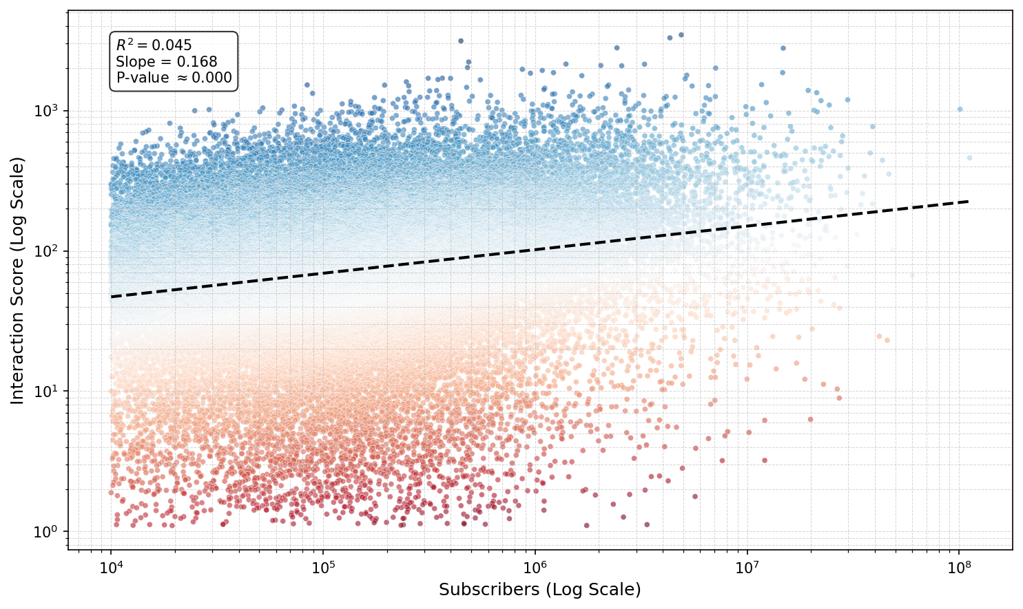
The Link Between Success and Connectivity
A Bit of Machine Learning: OLS Analysis
Does having millions of subscribers guarantee a loyal, active community? You might expect a straight line: more viewers = more interaction. But our analysis of over 45,000 YouTube channels reveals a different reality.
We ran an Ordinary Least Squares (OLS) regression on log-transformed data to predict a channel's Interaction Score (accumulated groups scores on channels) based on its subscriber count. This approach allows us to compare massive channels like PewDiePie with niche creators on a fair scale.
What does this mean?
- Drastic Diminishing Returns: Because this is a log-log model, the coefficient (0.17) represents elasticity. It implies that a 100% increase in subscribers (doubling your channel size) yields only a ~12.5% increase in community connectivity. Engagement does not scale linearly with fame; it trails far behind.
- The "Cult Classic" Effect: The incredibly low R-squared (0.045) tells us that subscriber count explains only 4.5% of the variance in interaction. The other 95.5% is driven by hidden factors: likely content quality, niche appeal, or personality.
In a Log-Log model \((\log(Y) = \beta \cdot \log(X))\), the relationship follows a Power Law \((Y = X^\beta)\).
If we double the subscribers \((X \rightarrow 2X)\), the new interaction score is: $$ (2X)^{0.17} = 2^{0.17} \times X^{0.17} $$ Since \( 2^{0.17} \approx 1.125 \), the score increases by a factor of 1.125, or +12.5%.
The scatter plot below visualizes this divergence. The Blue points represent "Cult Classics": channels that punch way above their weight, generating massive community interaction despite having fewer subscribers. The Red points indicate "Sleeping Giants": massive channels with comparatively passive audiences.
Mapping the Pathways: Category Flows
While the previous charts showed us composition and intensity, the Sankey Diagram maps the actual flow of audience members. It answers the question:
"If a user comments on a specific channel, where else are they likely to comment? And what other channels are they likely to engage with for each category?"
The width of the ribbons represents the score bridging two groups (calculated above). This reveals the "highways" of the YouTube ecosystem: the major routes that users travel between different topics.
- Hover over the Connecting Ribbons to see the score linking two groups.
- Hover over the Nodes (Vertical Bars) to see the total incoming or outgoing 'flow' for that specific group.
- You can drag the nodes vertically to reorganize the layout and disentangle the connections.
Visualize how your favorite channel connects to new categories
Wait, where is PewDiePie? Before you start searching the map for the absolute titans of YouTube (the channels with subscriber counts that look like phone numbers) we need to manage expectations. You might notice some "groups" you'd expect to be massive hubs (like Gaming | PewDiePie) are missing or surprisingly small. Why? Because subscribers don't equal connections. Our network is built on shared activity. A channel can have 100 million passive viewers, but if those viewers don't talk to each other or travel together to other channels, they don't form a strong network link. In this map, a small, tight-knit community often shines brighter than a silent stadium.
Navigating the Network
The Community Pathfinder
We often hear that social media creates "echo chambers": isolated bubbles where users only see what they already agree with. But our network shows that these bubbles are not impenetrable. There are bridges everywhere.
We built the Community Pathfinder to map these bridges. Instead of just suggesting similar content, this tool solves a routing problem: "What is the shortest social path from World A to World B?"
To build this, we inverted our network logic. We treated the "Connection Score" as speed:
$$ \text{Distance} = \frac{1}{\text{Edge Score}} $$
This means strong connections act as "superhighways" (short travel time), while weak connections are "winding backroads." The tool uses Dijkstra's algorithm to find the most efficient route between any Channel and Category, revealing the "Bridge Groups" that connect them.
Use the tool below to explore these hidden pathways. For example, discover how a user might organically drift from a Gaming channel to a Science discussion through shared group interests.
(For performance reasons, the tool is limited to the top 200 channels.)
- 1. Start Point: Select a channel you know (e.g., "VICE") and a category you like from this channel (e.g., "News & Politics").
- 2. Destination: Select a category you are curious about (e.g., "Pets & Animals").
- 3. Trace the Path: The tool will visualize the specific groups of videos that act as stepping stones connecting these two worlds.